|
|
Critique By:
emily swann (K:96)
2/26/2008 6:44:35 AM
i love the lanscape/seascape pictures they just connect with me love the use of the sun keeping a the rule of thirds in play if the person was standing straight rather than a bit bent over it would look like one of the postcard pictures
|
| Photo By: Michael Collison
(K:3)
|
|
|
Critique By:
emily swann (K:96)
4/13/2007 11:27:00 PM
nikki u create something out of nothing you must be needing ideas of things to take photographs of like it a bit blurry though like the shadow
|
| Photo By: Nikki Whyburn
(K:859)
|
|
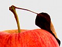
|
Critique By:
emily swann (K:96)
4/13/2007 11:25:06 PM
i like this image i would try making the apple redder and see what effects it would give like the stem and leaf they add that extra touch
|
| Photo By: Nikki Whyburn
(K:859)
|
|
|
Critique By:
emily swann (K:96)
4/13/2007 11:22:07 PM
i like this photograph but the pencil blends in too much with the wood grains but i suppose that when the title makes it ok UNDER THERE SOMEWHERE
|
| Photo By: Nikki Whyburn
(K:859)
|
|
|
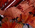
Critique By:
emily swann (K:96)
4/13/2007 11:19:46 PM
i like the range of colours the blue is a bit to bright but thats ok if the blue was placed on the sides it wouldn't work as well
|
| Photo By: Nikki Whyburn
(K:859)
|
|
|
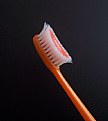
Critique By:
emily swann (K:96)
4/13/2007 11:16:41 PM
hey nikki do you still keep the toothbrush in your pencil case hehe!
|
| Photo By: Nikki Whyburn
(K:859)
|
|
|
Critique By:
emily swann (K:96)
11/17/2006 5:42:37 AM
thanks
welcome to usefilm
|
| Photo By: emily swann
(K:96)
|
|
|
Critique By:
emily swann (K:96)
10/21/2006 12:46:30 AM
i like the blue tone and the sharpness of the droplets with the textural reflection
|
Photo By: Susie Peek-Swint
(K:7303)

|
|
|
Critique By:
emily swann (K:96)
10/21/2006 12:36:22 AM
the colour and tones of the sky are wonderful and relaxing
|
| Photo By: Marian Man
(K:80636)
|
|
|
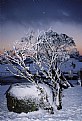
Critique By:
emily swann (K:96)
10/21/2006 12:29:26 AM
i like the colour of the sky and the ice on the tree but i think it would look better if the rock wasn't there.
|
| Photo By: john davis
(K:1684)
|
|
|
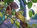
Critique By:
emily swann (K:96)
10/19/2006 8:51:33 AM
the spotted leaves twisting around the wire looks great
especially the brown tinge on the leaves
|
| Photo By: Nikki Whyburn
(K:859)
|
|
|
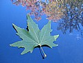
Critique By:
emily swann (K:96)
10/19/2006 8:47:45 AM
i like the reflection ( it has great autumn colours which contrast with the autumn leaf) and the crispyness of the leaf
|
| Photo By: Nikki Whyburn
(K:859)
|
|
|
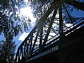
Critique By:
emily swann (K:96)
10/19/2006 8:44:46 AM
i like this imagebecause of the sun seeping through the trees
|
| Photo By: Nikki Whyburn
(K:859)
|
|
|
Critique By:
emily swann (K:96)
10/19/2006 8:11:36 AM
i like the detail of the eye but the top eyelashes could look better if they didn't bend, also if the bottom eyelashes were thick or as thick as the top it would be excellent
looks great in black and white.
well done
|
| Photo By: Stace Walker
(K:4175)
|
|
|
Critique By:
emily swann (K:96)
10/19/2006 7:58:08 AM
i like the angle in which you took the photo from and the different colours in the foreground compared to the background (light pink to dark pink).
The focus of the subject matter and the blurred background produces a admirable composition.
|
| Photo By: narabia
(K:9563)
|
|


![Photograph By Nelson Moore [Kes] -](http://thumbs.imageopolis.com/images/6/0/0/5/6005/1537290-tn.jpg "Photograph By Nelson Moore [Kes] -")