|
|
Critique By:
E R (K:196)
2/25/2005 3:40:01 PM
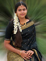
Lovely, softly-lit, well framed and posed portrait. I'm not sure about the background--its just a bit extreme for my taste, at least in green. I think that that sort of active background would work better in warm tones--reds and oranges, perhaps. If you have a layered copy of this, you could try shifting just the background colors into the warmer ranges using the Hue slider in Hue/Saturation.
Just a thought...
Elaine
|
| Photo By: Bhaskar A. V.
(K:1246)
|
|
|
Critique By:
E R (K:196)
2/25/2005 3:37:07 PM
This is a great candid potrait. The eye contact, soft lighting, and contextual elements (ie, the lamb) make it intresting and aesthetic.
Two suggestions: This image seems to be oversharpened; it has a digitized graininess that is rather distracting. Second, I think that burning in that out-of-focus snowflake over his right cheek would improve the portrait subtlely by keeping the focus on his face.
A great shot, that conveys a lot about the place.
Cheers!
Elaine
|
| Photo By: Talal Salaam
(K:15)
|
|
|
Critique By:
E R (K:196)
2/18/2005 9:26:46 PM
This is a great job of taking an interesting photo of a very mundane subject. It reminds one of horse-drawn carriages; the boy's wistful expression is perfect. A nice capture.
|
| Photo By: R. W.
(K:508)
|
|
|
Critique By:
E R (K:196)
2/15/2005 8:20:44 PM
I prefer the original version over the lightened one. I think one of the more appealing aspects of this shot is the fact that the bride IS in near-silhouette, a nice contrast to the (otherwise similar) bridesmaids. Normally brides are pictured in as bright light as possible, very floaty pics--this is a nice change from the usual cliche.
|
| Photo By: tybo n
(K:962)
|
|
|
Critique By:
E R (K:196)
2/15/2005 8:17:48 PM
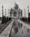
The challenge with photographing a popular tourist site is that it has already been photographed a million or so times before. Its difficult to avoid cliche. But this is different. I like:
--the unusual framing that does not include the entire reflection pool
--the "not-quite-monochrome" treatment of color; the hint of warm tones you've left in the structure is terrific and gives the feeling of an old lithograph
--the amazing sharpness and detail
I'm a little confused by:
--the two bits of bright orange and bright red (presumably clothing) that you've left in the frame; I find it a bit distracting. On the other hand, they complement the warm tones in the mosque...
Thanks for sharing this with us; a terrific image overall, one that I'd hang on my wall.
Cheers!
Elaine
|
| Photo By: Pradeep B
(K:2235)
|
|
|
Critique By:
E R (K:196)
2/15/2005 8:12:31 PM
How did you convince him to let you photograph? Had you been talking with him?
I especially like the little cluster of people in the background. It add an air almost of humor to this photo--here you are, seemingly in the middle of a desert, with a Hindu monk on an accessorized bicycle and a few others hanging around in the background!
The burned out sky in the upper right is a pity, but difficult to avoid...
Cheers,
Elaine
|
| Photo By: Bikas Das
(K:6544)
|
|
|
Critique By:
E R (K:196)
2/15/2005 5:57:42 PM
Color and tones: Pretty daring to shoot a portrait lighted in green! It's so easy for that color to come out just nasty looking--but this one works wonderfully.
Exposure: some might complain that there is not enough light on the eyes, but I think you've captured the perfect combination of illumination and mystery. There is just enough of her eye visible to prevent it from disappearing into her skull, but only JUST. The rest remains dark and mysterious. The viewer cannot access this woman's thoughts--they are veiled and hidden. This effect is heightened by what seems to be face paint (?)
COMPOSITION: The diagonal of her hand points the viewer back into the frame, which prevents the eye from traveling out off the the right.
I really like this photo: it would have made a terrific handbill for a play or film.
Cheers,
Elaine
|
| Photo By: Sammi Wells
(K:98)
|
|
|
Critique By:
E R (K:196)
2/15/2005 5:48:34 PM
What an unusual image! When I saw the thumbnail, I thought, "Is that some kind of odd dolphin?". Then before I read the title I thought, "oh, it's ICE!". And now that I recognize it, I like it. This must have been a favorite of your client--it would make a great add--you just need to come up with some quirky one-liner to go along the bottom.
|
| Photo By: sean slavin
(K:3488)
|
|
|
Critique By:
E R (K:196)
2/15/2005 5:39:53 PM
An interesting image. The placement of the second hand is also interesting--the ringed hand seems to be holding it from the side. Wonderful detail in the hands, though--every little crease...
|
| Photo By: Fabian Barreiro
(K:580)
|
|
|
Critique By:
E R (K:196)
2/15/2005 4:42:04 PM
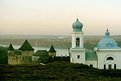
This is a very well-balanced composition--it's tricky to get a 'horizontal' subject like this framed in a way that keeps it interesting. I like the quality of the colors, very soft, as if its done in chalk. I tried scrolling my browers down just a bit to crop off the sky to just above the highest spire, and I like that composition as well, though I'm not sure if that sort of crop would make it feel a bit too cramped...
|
| Photo By: Nancy B Brannaman
(K:445)
|
|
|
Critique By:
E R (K:196)
2/15/2005 4:36:45 PM
I like the fact that the subject of the photo is almost silhouetted--the artist directing the viewer toward his work.
|
| Photo By: Nancy B Brannaman
(K:445)
|
|
|
Critique By:
E R (K:196)
2/15/2005 4:29:35 PM
Mne nravitsya etot portret. This looks like a combination of a photo and a painting. I like the color scheme, just a few different shades of yellow and orange. In some ways it reminds my of a grittier, truer version of some of the old socialist-realism pictures of farmers, etc. Very well done.
|
| Photo By: Lasha Chkhikvishvili
(K:1328)
|
|
|
Critique By:
E R (K:196)
8/18/2003 8:16:19 AM
Nancy! HOw are you doing? Remember me, the summer '02 econ intern? I did a google search on 'Ukraine' for this site and found a whole bunch of your photos. Are you still in Kiev? ER
|
| Photo By: Nancy B Brannaman
(K:445)
|
|
|
Critique By:
E R (K:196)
8/18/2003 8:11:30 AM
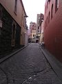
It's always fun to photograph these long alleys. It's important with them, though to make sure that they don't tilt - I'd try to straighten this one out. The white sky is a bit distracting , too, but the colours of the walls are quite striking. ER
|
| Photo By: Namrata Chattaraj
(K:244)
|
|
|
Critique By:
E R (K:196)
8/18/2003 8:09:46 AM
This is an interesting composition you've chosen! I like the fact that the main part of the boat is not included. This also has the effect of making this a historically neutral image: theoretically, this could be 100, 500 years ago. Except of course they had no cameras then 
|
Photo By: Jim F
(K:8859)

|
|
|
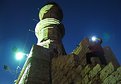
Critique By:
E R (K:196)
8/18/2003 8:00:43 AM
This is a very interesting photo. By including a photographer in the pic, you seem to be commenting on the tourist aspect of the stuctrure. The dramatic lighting works well, although the big blob of light is very distracting (have you thought of cloning that out digitally?). I like the angle you've chosen as well. One question: I'm afraid I don't know what this structure is. What is it?
|
| Photo By: TH ©
(K:67)
|
|
|
Critique By:
E R (K:196)
8/18/2003 7:52:19 AM
What a wide range of tones you've caught in one frame here! What was your media - digital? If so I am very impressed - your exposure must have been spot on! The only comment I'd make would be that the dark trees are rather distracting, although I'm not sure what you could have done about it. Good job!
|
| Photo By: zhe qing ZHUANG
(K:10)
|
|