|
|
Critique By:
Alex Wasilewski (K:888)
7/4/2006 10:33:00 PM
I totally agree with with about the blurring of the people and I love how there is so much going on in the picture, for your eye is taken in every direction...Also, you did a great job keeping the camera steady, for the background in is perfect detail...im guessing you propped it up, cuz those Metro trains are quite cramped for a tripod...What a great capture and an awesome exposure!!!
|
| Photo By: Emily Kennedy
(K:261)
|
|
|
Critique By:
Mary Slade (K:40338)
7/4/2006 7:36:59 PM
Great one Emily. I love the reflections and the movement. And the colours and brightness. Great idea.
|
| Photo By: Emily Kennedy
(K:261)
|
|
|
Critique By:
Cleveland Smith (K:7006)

7/4/2006 12:35:48 AM
Emily, I like the feel of this image. I think that you have accomplished what you wanted. I agree that you should crop the right side of the image, the window frame seems to get slightly in the way of ones eyes. The top right seems to be a little hot, maybe it could be burned in some?
|
| Photo By: Emily Kennedy
(K:261)
|
|
|
Critique By:
James Cook (K:38068)
7/4/2006 12:05:11 AM
Sure. Let me know what you come up with.
|
| Photo By: Emily Kennedy
(K:261)
|
|
|
Critique By:
Emily Kennedy (K:261)
7/3/2006 11:42:14 PM
Thank you for your comment, yes I know exactly what you mean, great explanation by the way  That is good advice, I will keep it in mind for my next shot, thank you again, emily That is good advice, I will keep it in mind for my next shot, thank you again, emily
|
| Photo By: Emily Kennedy
(K:261)
|
|
|
Critique By:
deniz cesmeci (K:5726)
7/3/2006 11:35:38 PM
for this i have nothing to say
sorry my friend
becousee
.
.
.
.
its soo cute it show the all the feelings of a teenager .
with this wooks the atmosphere is like that she has afraid to be old like this woods and the handel of the door over the girl it gaves a good contrast with her hairs  nice but nice work my friend nice but nice work my friend
|
| Photo By: Emily Kennedy
(K:261)
|
|
|
Critique By:
deniz cesmeci (K:5726)
7/3/2006 11:31:41 PM
i dont how can i explain in english but i ll try :S
i ll put the sun behind the head of your object so you have a more miserably feeling in your photo so is a littel bit over lighted
i dont now can you remember e.t. (the film wih the creature ) there was a scene he goes with a supermarket car in front of the moon i mean something like this i hoppe you understand me but
good look good idea
nice comps.
congrs.
|
| Photo By: Emily Kennedy
(K:261)
|
|
|
Critique By:
Emily Kennedy (K:261)
7/3/2006 11:30:16 PM
Thank you very much for your comment James, I've taken your advice and will crop the image as soon as I can, thank you once again, Emily
|
| Photo By: Emily Kennedy
(K:261)
|
|
|
Critique By:
James Cook (K:38068)
7/3/2006 11:22:49 PM
Good motion and reflective combination. I especially like the guy at the right who isn't looking at the camera but gives this wonderful stare-down impression. I might try trimming the top and right hand side a wee bit, but mostly this is done.
|
| Photo By: Emily Kennedy
(K:261)
|
|
|
Critique By:
Emily Kennedy (K:261)
5/7/2006 6:43:12 PM
Thank you very much for your encouragement, it's really nice to hear and motivates me to strive for the 'perfect' image. I have just finished my AS year for photography so am anxious about the results, I am then going to enter for the A level next year.
|
| Photo By: Emily Kennedy
(K:261)
|
|
|
Critique By:
Mary Slade (K:40338)
5/7/2006 4:11:27 PM
Brilliant image Emily- clarity and mystery together! The silhouette and blue sky great. And the sunrays so effective.
|
| Photo By: Emily Kennedy
(K:261)
|
|
|
Critique By:
Keith Fitzgerald (K:1117)
5/3/2006 9:02:01 PM
I really like this. Bold effect and it works.
|
| Photo By: Emily Kennedy
(K:261)
|
|
|
Critique By:
Mary Slade (K:40338)
4/30/2006 7:50:33 PM
I like it Emily! Like the B&W, little shadow on the face and not seeing the eyes. It just goes with the loneliness theme. Suits textured background too. Could be the start of a documentary or film!
|
| Photo By: Emily Kennedy
(K:261)
|
|
|
Critique By:
matthew kinslow (K:2525)
4/20/2006 6:29:39 AM
Hey man... the photos not that bad... should be a little more contrast or darker... the lens flare has got to go.. I don't know people use that in photoshop it's cheasy... for one the light source isn't comming from that angle... and the light is a little harsh on her hand... it makes her look uncomfortable and not lonely... if you want lonely... put her in a very dark room... with a single light kinda bright with sharp edges... just let the shadows bring her out... good luck
|
| Photo By: Emily Kennedy
(K:261)
|
|
|
Critique By:
Mary Slade (K:40338)
3/9/2006 4:42:59 PM
Good to hear from you Emily. Hope you get the coursework done by Thursday, and all the best for the exams. Don't work too hard though!
|
| Photo By: Emily Kennedy
(K:261)
|
|
|
Critique By:
Emily Kennedy (K:261)
3/9/2006 4:19:28 PM
Thank you for your comments, very constructive. I understand about the flash and will try alternate methods. Thank you very much Mary, yes my courses are going relativly smoothly, at the moment! I've got my photography coursework deadline next Thursday so hopefully I will get it all done in time and then the exam hits :s I would like to say, I admire your work so it is really encouraging to recieve such nice comments from you, thank you, Em
|
| Photo By: Emily Kennedy
(K:261)
|
|
|
Critique By:
Mary Slade (K:40338)
3/9/2006 2:35:04 PM
Brilliant image- great to see the angle and perspective like that and the grain of the wood. Hadn't heard from you, so it was a delight to see another of your pictures. Hope your A level coures going well.
|
| Photo By: Emily Kennedy
(K:261)
|
|
|
Critique By:
Ash (K:9427)
3/6/2006 12:42:32 AM
I like the simplicity of the black and white. You have great perspective and depth of field.
|
| Photo By: Emily Kennedy
(K:261)
|
|
|
Critique By:
Saad Alafaliq (K:802)
3/5/2006 8:47:46 PM
Hi Emily.
I have a couple of tips that may help you make a better version of this photo.
1. I'm really uncomfortable with the reflections on the metal parts (frets?). Did you use flash? If you did, maybe you should consider an alternate diffused light source thet should'nt be so close to the camera.
2. A colorful background could be very helpful. A board of the color of your choice and a dedicated light source (desk lamp) for the background would do the job.
try to do a coulored version with different angles and focus points and different shutter/F-number combos and show us what you came up with.
Regards
Saad
|
| Photo By: Emily Kennedy
(K:261)
|
|
|
Critique By:
Mary Slade (K:40338)
3/3/2006 11:47:59 AM
Such a peaceful picture. I really like the trees in the corner and top of the shot.
|
| Photo By: Emily Kennedy
(K:261)
|
|
|
Critique By:
Mary Slade (K:40338)
3/3/2006 11:46:39 AM
Good to see another picture of yours Emily. I agree- I like it cropped like this too. Just to see green and no sky is powerful. And all their indicidual movements.
|
| Photo By: Emily Kennedy
(K:261)
|
|
|
Critique By:
Paul's Photos (K:35235)
2/21/2006 11:20:26 PM
excellent.. love the dam.. maybe I would crop the sky especially since the sky is washed out..it may bring more emphasis to the landscape
|
| Photo By: Emily Kennedy
(K:261)
|
|
|
Critique By:
Mary Slade (K:40338)
2/20/2006 2:54:09 PM
Emily, it is great to see another image from you. And this has come out such a good screen size! (I find it hard just getting that right!). I like the black and white- it makes it timeless. And where you took it from- I just keep following the path and steps. And to have the texture of the bricks, trees and water...brilliant picture!
|
| Photo By: Emily Kennedy
(K:261)
|
|
|
Critique By:
Mary Slade (K:40338)
2/14/2006 5:43:40 PM
Really like this- the angles lines and colours. Good to see a fellow Kent Englander! Taught A Level for years, (not art!) so I really hope that you get what you want from it and that you enjoy it. Commented on the guitar piccy too- great one.
|
| Photo By: Emily Kennedy
(K:261)
|
|
|
Critique By:
Mary Slade (K:40338)
2/14/2006 5:08:24 PM
However you did this, it is great! Wonderful to see the textures even on the strings! Husband has guitars and really likes this too.
|
| Photo By: Emily Kennedy
(K:261)
|
|
|
Critique By:
Christian Miller (K:988)
2/5/2006 10:53:42 PM
I really like the angle of the shore and the silhouette. - Christian
|
| Photo By: Emily Kennedy
(K:261)
|
|
|
Critique By:
Ferran Rial (K:6670)
2/5/2006 10:42:39 PM
I lieke the simplicity and the composition. Very graphic and simple. Well done Emily!
ferran
|
| Photo By: Emily Kennedy
(K:261)
|
|
|
Critique By:
ictenbey / Emrah ICTEN (K:16316)
2/5/2006 10:30:26 PM
so nice image
|
| Photo By: Emily Kennedy
(K:261)
|
|
|
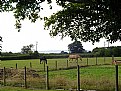
Critique By:
greg collins (K:12273)
2/4/2006 8:21:12 PM
I like the idea of framing like this and the fence is as interesting as the landscape - love how the timber crosses itself.
Greg
|
| Photo By: Emily Kennedy
(K:261)
|
|
|
Critique By:
Rashed Abdulla (K:163889)
2/4/2006 7:18:27 PM
very plesing composition, and a wondeful capture , all of the best.
|
| Photo By: Emily Kennedy
(K:261)
|
|