|
|
Critique By:
Cary Shaffer (K:393)
4/14/2002 12:14:37 AM
try cropping it to give more accent to the light area. keep some of the darkness, but i don't think you need so much. i think it will pop out much more.
|
| Photo By: Carl Beihl
(K:357)
|
|
|
Critique By:
Cary Shaffer (K:393)
4/14/2002 12:01:04 AM
good eye. how long did it take to line up your camera? i bet a couple of minutes. great shot.
|
| Photo By: Yan McLine
(K:0)
|
|
|
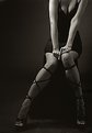
Critique By:
Cary Shaffer (K:393)
4/4/2002 7:07:53 AM
random pop. pretty cool idea. i like the DOF. i may suggest a tighter crop since the handle thingy on the rear box gets lost. losing some frame off the top may make it a bit more abstract. cool shot.
|
| Photo By: Kari Reed
(K:5)
|
|
|
Critique By:
Cary Shaffer (K:393)
3/19/2002 1:14:00 PM
wow, i missed the color the first time through. excellent idea. i think the lady in blue is just enough to upset the balance and make the photo alot more interesting. alone, it is a great shot, but the color adds so much more. i don't know about the guy in red, since it is so small here. i bet an 11x14 is awesome. good eye and good job.
|
| Photo By: Carl Beihl
(K:357)
|
|
|
Critique By:
Cary Shaffer (K:393)
3/19/2002 12:26:12 PM
i see that she has the c-47's on her shirt. if she's a photo assistant, i want one.
|
| Photo By: Antonio napoli
(K:0)
|
|
|
Critique By:
Cary Shaffer (K:393)
3/16/2002 10:44:42 PM
very nice. i like it alot.
|
| Photo By: Chris Blaszczyk
(K:610)
|
|
|
Critique By:
Cary Shaffer (K:393)
3/16/2002 9:30:18 AM
Carlos, man shooting from the air is tuff. nice job. i've done it, or i should say i tried, from our news chopper at work. i didn't get very many prints at all fom it. in fact, most of them were really bad. you've done a fine job. nice exposure, focus and composition.
|
| Photo By: Carlos Lopez
(K:16)
|
|
|
Critique By:
Cary Shaffer (K:393)
3/13/2002 5:34:25 PM
i agree with altaf. supurb job. you don't get this stuff with luck. i f this is a crop, we want the neck back!
|
| Photo By: Robert Stewart
(K:15)
|
|
|
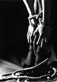
Critique By:
Cary Shaffer (K:393)
3/9/2002 9:29:29 AM
dudes, thanks for the comments.
alot of the problem is my scanning ability. i'm still working on it. the original is sharp. i can't keep it sharp when it uploads. hopefully it'll get there.
plus x is old, but it is a fine grain stock.
i agree with the too dark on the right stuff. i'm going to work on printing it better. i should have used a reflector to brighten it up a little. i actually wanted really hard light for it. i wanted to really bring the texture of the rope out.
dave, it's the same hottie as in my other photos.
thanks for the comments. i've only been doing stills for about a year and a half. the help i get here is huge!
|
| Photo By: Cary Shaffer
(K:393)
|
|
|
Critique By:
Cary Shaffer (K:393)
3/8/2002 8:56:23 PM
thanks sean. it was my first time using hot lights. working in TV has its perks. like borrowing light kits.
|
| Photo By: Cary Shaffer
(K:393)
|
|
|
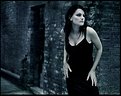
Critique By:
Cary Shaffer (K:393)
3/7/2002 10:11:09 AM
very nice. love the pose. great shot.
|
| Photo By: Rene Asmussen
(K:138)
|
|
|
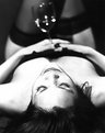
Critique By:
Cary Shaffer (K:393)
3/5/2002 4:06:57 PM
i absolutely love this image. seems so innocent. yet, there is something mysterious about it. it provokes alot of thought. there is one thing i would change. i would make the tea cup handle blue as well. the tea should be the only warm image, and i love how it sticks to her lips. just my humble opinion.
|
| Photo By: Helena K Karlsson
(K:23)
|
|
|
Critique By:
Cary Shaffer (K:393)
2/28/2002 12:50:27 PM
marcus, i'm pretty sure that my problem is my scanning ability. everytime i shrink stuff down small enough to load, it looks like crud. but, i will try the 250 rating and see what happens. i'll let ya know.
|
| Photo By: Cary Shaffer
(K:393)
|
|
|
Critique By:
Cary Shaffer (K:393)
2/27/2002 1:55:53 AM
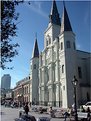
nice shot, but i wanna see the top of the steeple. i like the tree framing it.
|
| Photo By: Jason Frey
(K:6)
|
|
|
Critique By:
Cary Shaffer (K:393)
2/26/2002 11:05:50 AM
sweet.
|
| Photo By: Kristupa Saragih
(K:1031)
|
|
|
Critique By:
Cary Shaffer (K:393)
2/25/2002 5:02:03 PM
marty, thanks. it is half full, of course. i took some time to look through your portfolio, nice stuff. i believe we are similar in our styles. i love the hot chicks in the city stuff. i need to get some more stuff posted.
|
| Photo By: Cary Shaffer
(K:393)
|
|
|
Critique By:
Cary Shaffer (K:393)
2/25/2002 10:29:05 AM
boy, is that ever neat. really. i wish we had sunflower fields that big in PA. ela is pretty neat, too. how come there is a really cruddy sunflower right in front of her?
|
| Photo By: Chris Blaszczyk
(K:610)
|
|
|
Critique By:
Cary Shaffer (K:393)
2/25/2002 12:07:25 AM
very very well done. i would not change a single thing.
|
| Photo By: Chris Lawrence
(K:124)
|
|
|
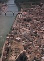
Critique By:
Cary Shaffer (K:393)
2/15/2002 8:45:11 PM
very, very cool. do people live there? nice use of repetition and color. definately a wall hanger. no doubt.
|
| Photo By: CJ McKendry
(K:1388)
|
|
|
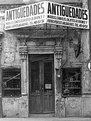
Critique By:
Cary Shaffer (K:393)
2/14/2002 9:08:48 PM
i like it. though, it seems to have a little tilt to the left. the texture of the walls is fantastic.
|
| Photo By: Arturo Fajardo
(K:6)
|
|
|
Critique By:
Cary Shaffer (K:393)
2/13/2002 5:24:41 PM
i like it a lot. so many people would walk right past that. good concept. emphasizing the shadows. the only thing that i may suggest, maybe tilt down abit more to lose som of they tree trunks. i think that would make it a bit cleaner. however, i would be proud to hang it on the wall.
|
| Photo By: Anne Brown
(K:833)
|
|
|
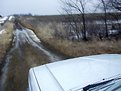
Critique By:
Cary Shaffer (K:393)
2/10/2002 3:08:37 PM
cool shot, nice cherokee. a little to white for my taste. get some mud on it. cool concept.
|
| Photo By: Lisa Brainard
(K:743)
|
|
|
Critique By:
Cary Shaffer (K:393)
2/10/2002 9:20:28 AM
very cool. i like it alot.
|
| Photo By: Chris Blaszczyk
(K:610)
|
|
|
Critique By:
Cary Shaffer (K:393)
1/31/2002 11:04:38 AM
cool shot. although i would crop it so you can't see the matt on the bottom. keep all the head room and it will look like you're free climbing a monster of a cliff.
|
| Photo By: Lloyd Betsworth (uk)
(K:37)
|
|
|
Critique By:
Cary Shaffer (K:393)
1/31/2002 11:04:14 AM
cool shot. although i would crop it so you can't see the matt on the bottom. keep all the head room and it will look like you're free climbing a monster of a cliff.
|
| Photo By: Lloyd Betsworth (uk)
(K:37)
|
|
|
Critique By:
Cary Shaffer (K:393)
1/28/2002 7:15:23 PM
pretty cool shot. i like the blue sand, it gives a nice contrast to the butts. i don't think it would work with normal sand, or marlboro lights.
|
| Photo By: Alexander R Perez
(K:0)
|
|

")