|
|
Critique By:
David Lockwood (K:977)
8/26/2007 9:48:08 PM
well taken shot, the smooth texture contrasts very well with the sharp edges of the broken mud...
-dave
|
| Photo By: mohammad tavakkoli
(K:74)
|
|
|
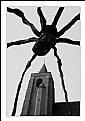
Critique By:
David Lockwood (K:977)
8/26/2007 9:41:20 PM
I like the contrast you added by separating the background from the spider...
great detail,
-dave
|
| Photo By: John Hatz
(K:156973)
|
|
|
Critique By:
David Lockwood (K:977)
8/21/2007 8:49:08 PM
great texture and sharpness! that 50mm 1.8 is a terrific lens,
take care,
-dave
|
| Photo By: Mehul Chimthankar
(K:18655)
|
|
|
Critique By:
David Lockwood (K:977)
8/21/2007 6:22:29 PM
lovley textures and composition!
-dave
|
| Photo By: RC. Dany
(K:64104)
|
|
|
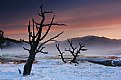
Critique By:
David Lockwood (K:977)
8/21/2007 5:01:24 PM
great texture and lighting...
nice shot,
dave
|
| Photo By: Ian McIntosh
(K:42997)
|
|
|
Critique By:
David Lockwood (K:977)
8/20/2007 8:03:28 PM
Hi Robert, its a little hard to explain so ill reference the wikipedia article
http://en.wikipedia.org/wiki/Rule_of_thirds
-dave
|
| Photo By: Robert Sukup
(K:345)
|
|
|
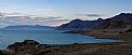
Critique By:
David Lockwood (K:977)
8/20/2007 7:55:08 PM
Thanks for the comment Brigitte, I didn't see the Stone Mother, but I plan on visiting there again soon... Im now living in Reno and its only a short drive away...
I heard there is a geyser somwhere on the lake as well, which I hope to find...
|
| Photo By: David Lockwood
(K:977)
|
|
|
Critique By:
David Lockwood (K:977)
8/20/2007 7:28:56 PM
its a nice shot, i think it might be enhanced by using the rule of thirds...
were you in an airplane when you took this?
-David
|
| Photo By: Robert Sukup
(K:345)
|
|
|
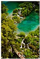
Critique By:
David Lockwood (K:977)
8/6/2007 7:31:08 PM
great colors and a beautiful location.
dave
|
| Photo By: Jeffry Surianto
(K:768)
|
|
|
Critique By:
David Lockwood (K:977)
8/6/2007 7:27:15 PM
its a really beautiful location... it might be nice to get a shot without the people there,
dave
|
| Photo By: Marijo Bacho
(K:173)
|
|
|
Critique By:
David Lockwood (K:977)
8/6/2007 7:24:38 PM
nice lighting and colors...
dave
|
| Photo By: Bijit Bose
(K:5871)
|
|
|
Critique By:
David Lockwood (K:977)
7/29/2007 7:25:06 PM
very nice shot of a beautiful girl.
-dave
|
| Photo By: Gosia Barta
(K:87)
|
|
|
Critique By:
David Lockwood (K:977)
7/16/2007 8:36:45 AM
beautiful shot! i might lessen the sharpening a little, but looks great,
dave
|
| Photo By: Adam Bi
(K:112)
|
|
|
Critique By:
David Lockwood (K:977)
7/14/2007 6:37:25 AM
I like it, however ive never seen a safety pin used as a fish hook before...
whatever gets the job done i guess,
dave
|
| Photo By: Brian Watters
(K:244)
|
|
|
Critique By:
David Lockwood (K:977)
7/13/2007 10:34:30 PM
thats an amazing picture, congratulations,
david
|
| Photo By: Ahmed Ismail
(K:19853)
|
|
|
Critique By:
David Lockwood (K:977)
7/13/2007 7:34:21 AM
Thats awsome, its almost like a comic book... id love to see more of the story!
cheers,
dave
|
| Photo By: Mervo
(K:8643)
|
|
|
Critique By:
David Lockwood (K:977)
7/13/2007 7:29:44 AM
it looks like a nice picture, i wish I could see it a little better though... you can post up to 850px across...
its a nice photo,
cheers,
dave
|
| Photo By: Janet Garinger
(K:900)
|
|
|
Critique By:
David Lockwood (K:977)
7/13/2007 7:27:13 AM
is that an old train station?
is she waiting for a train...?
nice shot,
dave
|
| Photo By: A. W. Osnafotos
(K:6373)
|
|
|
Critique By:
David Lockwood (K:977)
7/13/2007 7:25:27 AM
that doesn't look like a good place to swim....
nice shot...
dave
|
| Photo By: Bildee Jones
(K:20)
|
|
|
Critique By:
David Lockwood (K:977)
7/13/2007 7:23:29 AM
I like it, nice shot...
dave
|
| Photo By: Robert Waddingham
(K:3389)
|
|
|
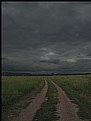
Critique By:
David Lockwood (K:977)
7/13/2007 7:21:35 AM
it must have went somewhere...
nice shot
Dave
|
| Photo By: Anastasia R.
(K:778)
|
|
|
Critique By:
David Lockwood (K:977)
7/8/2007 1:49:57 AM
its a great shot, i might recommend using a noise reducer and a bit of sharpening on it though...
cheers,
dave
|
| Photo By: Didem Bilgic
(K:581)
|
|
|
Critique By:
David Lockwood (K:977)
6/30/2007 8:14:59 PM
there is also the same piece in Tokyo Japan, great shot btw!
http://www.usefilm.com/image/1254759.html
-dave
|
Photo By: Peter De Rycke
(K:41212)

|
|
|
Critique By:
David Lockwood (K:977)
6/30/2007 8:34:26 AM
great color, composition, and contrast. superbly done!
-dave
|
| Photo By: NaDa .M
(K:941)
|
|
|
Critique By:
David Lockwood (K:977)
6/30/2007 8:31:21 AM
a very nice set of photos, your layout fits the subject well and the narritive ties it all together...very well done!
-dave
|
| Photo By: Rachel Leah
(K:26110)
|
|
|
Critique By:
David Lockwood (K:977)
6/26/2007 5:13:07 PM
I guess because the blur of the background contrasts so much with the sharpness of your subject. to me it gives the appearance of being cut and pasted (although I don't think you did that). I would guess that you selectivly gaussian blurred the background, and in my opinion it has given it a 'photoshopped look.' if that is the original I would recommend a higher aperture. This is all just my opinion as well... btw, your wildlife pictures are fantastic...
cheers,
David
|
| Photo By: ed silva
(K:651)
|
|
|
Critique By:
David Lockwood (K:977)
6/26/2007 3:12:15 AM
its a thoughtful portrait... don't overdue it on the digital enhancements...If you can tell a picture has been photoshopped it looses a sense of credibility imo... personally, I would suggest trying this one in black and white...
cheers,
dave
|
| Photo By: ed silva
(K:651)
|
|
|
Critique By:
David Lockwood (K:977)
6/26/2007 2:08:08 AM
I like the composition quite a bit, however I feel the overexposed areas add too much contrast and make an overall harsher image then the softer image I image you are going for. I might recommend taking the same picture early in the morning or later in the evening... I enjoyed looking through your portfolio,
-David
|
| Photo By: Kim Flowers
(K:770)
|
|
|
Critique By:
David Lockwood (K:977)
6/19/2007 12:59:23 AM
i love it! wish it was a bit sharper though...
-dave
|
| Photo By: Paulo Aldana
(K:81)
|
|
|
Critique By:
David Lockwood (K:977)
6/19/2007 12:58:12 AM
its obviously a very nice shot and series...I would however like to see more of it. the small shots that are posted leave too much to the imagination and I for one would like to see them in a larger size, maybe 800px across... really nice series though,
-dave
|
| Photo By: Nicole Marcisz
(K:10268)
|
|