|
|
|
Lina Matlis
{K:95} 6/25/2008
|
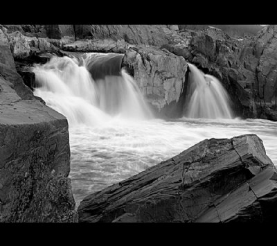
Now that I have seen the color picture, the b&W is much more captivating.
|
|
|
|
|
Lina Matlis
{K:95} 6/25/2008
|
Breath taken, you always have an eye for bringing out beauty.
|
|
|
|
|
ana ribeiro
{K:21290} 12/21/2006
|
i like theis one this way, the strenght of elements is amazing!
|
|
|
|
|
Teresa Moore
{K:11063} 8/18/2006
|
A beautiful B&W photo Paul. Great composition and great work.
|
|
|
|
 Massimo Di Maggio
 {K:-53658} 7/30/2006
|
It recalls me the place where I took my last photos ;) I saw also the colors version, I think this one is better, I like the BW tones and the water effect. Bye, Max
|
|
|
|
 Ivonne *
{K:8711} 7/22/2006
Ivonne *
{K:8711} 7/22/2006
|
ohhh...I like it !! I hear hum of water... Bravo for composition, realization and tones ! Regards, Ivonne
|
|
|
|
|
Kim Graziano
{K:2019} 7/18/2006
|
Awesome Photo! I'm always drawn to pictures with water as the subject. Kim
Also thanks for commenting on my photo. I'm extremely new to this & the positive reinforcement sure helps.
|
|
|
|
 stingRay pt.4 .
{K:250401} 7/1/2006
stingRay pt.4 .
{K:250401} 7/1/2006
|
I love the composure of this waterscape study Paul. The details are great as are the rock textures. I personally struggle with mono conversions mainly, I think, because my heart isn't in them. I recognise when a good conversion has been made but for me, I love to see the colours. Another thing I can't make up my mind about in shots of waterfalls and similar is the slow shutter speed effect that transforms water movement into strips of silk bearing no resemblance to the effect we see in reality. It looks good but it isn't natural. All in all though a very good composition Paul....You have a great portfolio and have done particularly well with awards....Congratulations, I applaud you. Thank-you for your recent visit and comment. All the best to you.....Ray
|
|
|
|
|
Ciprian Ilie
{K:13571} 6/28/2006
|
Lovely composition and excellent use of a slow shutter. Monochrome suits this image.
Regards,
Ciprian
|
|
|
|
 Susie OConnor
{K:34798} 6/28/2006
Susie OConnor
{K:34798} 6/28/2006
|
Pretty shot Paul. Ilike the shutter speeds effect on the water. Well chosen!
Susie
|
|
|
|
 Roberto Arcari Farinetti
{K:209486} 6/10/2006
Roberto Arcari Farinetti
{K:209486} 6/10/2006
|
very good quitness moment my friend.. best wishes and all the best
roby
7
good week end to you..
|
|
|
|
 milan
{K:254} 6/9/2006
milan
{K:254} 6/9/2006
|
Great photo. Yeah i know to what extent one might go for a nice snap :)
|
|
|
|
 NN
{K:26787} 6/9/2006
NN
{K:26787} 6/9/2006
|
Hi Paul! A very well composed shot with great tonal range. Beautiful!
|
|
|
|
 Mohsen Bayramnejad
{K:21377} 6/8/2006
Mohsen Bayramnejad
{K:21377} 6/8/2006
|
WooW!..Paul..!
this is really great shot and looks beautiful in B&W!..your creative composition and artistic use of D-O-F and slow shutter speed in this one just make me feel good! Thanks for sharing this beautiful photograph!
Cheers!++7
|
|
|
|
 Phillip Minnis
{K:13131} 6/6/2006
Phillip Minnis
{K:13131} 6/6/2006
|
A fabulous B&W image, Paul! Beautifully captured!
Cheers
Phil
|
|
|
|
 Rui Palha
{K:13624} 6/6/2006
Rui Palha
{K:13624} 6/6/2006
|
Very, very beautiful place and composition.
|
|
|
|
 donato r.
{K:16361} 6/6/2006
donato r.
{K:16361} 6/6/2006
|
excellent!
|
|
|
|
 Marcus Armani
{K:36599} 6/1/2006
Marcus Armani
{K:36599} 6/1/2006
|
wow this is another of your fantastics shots, Its amazing how you used the slow shutter to get the beautiful effect on the falls while keeping perfect sharpness and detail on the rocks, not to mention a perfect perspective, excellent.
|
|
|
|
 Jeanette Hägglund
{K:59855} 5/30/2006
Jeanette Hägglund
{K:59855} 5/30/2006
|
Stunning shot and great choice to make it B/W! I also like your framing.
Jeanette
|
|
|
|
|
Marcus Armani
{K:36599} 5/20/2006
|
Beautiful scene here Paul as I have come to expect, the lighting and tones work well with the nice slow shutter effect on the water and texture of the rocks, excellent..
|
|
|
|
 Gayle's Eclectic Photos
{K:91109} 5/20/2006
Gayle's Eclectic Photos
{K:91109} 5/20/2006
|
hi, i prefer the b/w version...my eye goes straight to the neonish green in the center of color version and tho' i like the earthy hues of the rocks,image isn't as special as this version IMO....b/w puts the focus on forms and of course the contrast...am usually fond of the cinematic bold borders,but i don't feel it suits this image...perhaps if not so wide...just my eye ;>
regards,gayle
|
|
|
|
 Linda Imagefree
{K:72276} 5/18/2006
Linda Imagefree
{K:72276} 5/18/2006
|
Hi Paul, very nice light and textures, the tones and clarity are excellent with wonderful details, and I always like the slow shutter speed effects on water, a beautiful capture of the these waterfalls, well done!!
|
|
|
|
 Hugo de Wolf
{K:185110} 5/15/2006
Hugo de Wolf
{K:185110} 5/15/2006
|
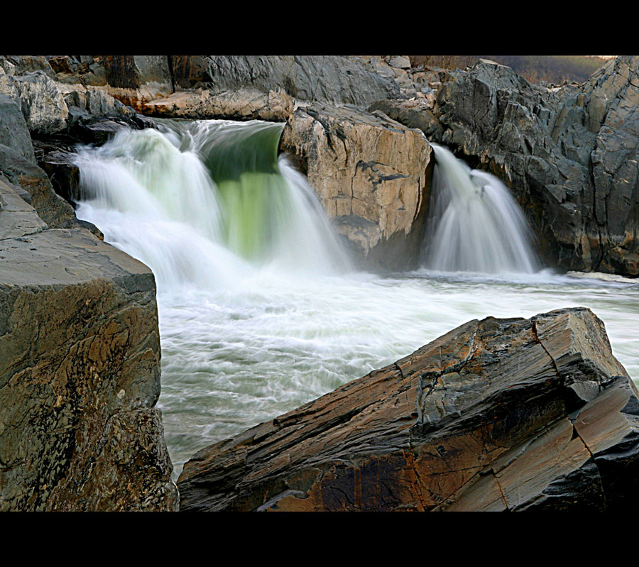
Hi Paul, thanks for posting the colour version. Indeed a very difficult decision.... If I'd be forced to make a decision, I think I would instinctively go for the colour one, but can't really put my finger on it why. I think the green water does it for me...:) But in making th comparison, I realise my first comment was too hasty....:)
Cheers,
Hugo
|
|
|
|
 Thilo Bayer
{K:50358} 5/15/2006
Thilo Bayer
{K:50358} 5/15/2006
|
Hi Paul,
I love the idea that a photographer is kind of a risk seeker =) I think this image works well in BW. Maybe it's a tad shaky, but with f/19? No wonder =)
Thilo
|
|
|
|
 Paul's Photos
{K:35235} 5/15/2006
Paul's Photos
{K:35235} 5/15/2006
|
Chuck, thanks for the comment.. if you want to see the color version, I attached it to the image...
|
|
|
|
|
Paul's Photos
{K:35235} 5/15/2006
|
Hugo, thanks for the critique. Actually, the day was a sunny day but the sun was setting at the time I was taking this photo. I attached the color version so that you can see the difference. I agree that the color and b/w are not really comparable. Usually in b/w, contrasts play a more important role. Each portrays a scene in a different way and both have their pros and cons. I think if the sun was shining on this area it may have been a more dramatic color version. But, I think the color version is good and can stand on its own.
Thanks again for the comment, great critique as usual.
|
|
|
|
|
 Johancharles Boers
{K:4370} 5/13/2006
Johancharles Boers
{K:4370} 5/13/2006
|
Paul,
I think it was a great choice with the B&W...it gives it a little more pop...in my opinion..the tonal range on the photo is excellent as well...
Chuck
|
|
|
|
|
Hugo de Wolf
{K:185110} 5/13/2006
|
Hi Paul, You really made me curious what the colour version looks like. Looking at the lighting in this photo, I think the chances of warm tones of the rocks and a green / blue hue of the water (which could've created a very good contrast in colours) are pretty slim. It looks like a rather overcast day, making the rocks more dark and wet, as well as the water, unable to reflect the blue sky, more earthy in it's tones. If that's the case, I think the B&W works well, and would be the proper choice.
I always feel a bit ambiguous when it comes down to chosing between black and white or colour (generally speaking), as I think the two are barely comparable. In composing a photo with colour, I tend to believe the array of colours, and the contrast between them is the key issue, whereas a photo taken in B&W is primarily composed around a contrast in tones, building on light and intensity. For example, a subject build up of red and blue would work fine in colour, but would lose its impact in B&W, unless the subject also constitues of an array of dark and bright tones. Hope you see what I mean.
Back to this photo, I think the composition is very good, and it's technically spot on. The B&W isn't "intrusive" in creating or adding an atmosphere, and I think it's a good call - the element of choice just caught me off guard for a moment.
Well presented, too, the framing on top and below is always strong and effective, without playing a too important role. Good photo!
Cheers,
Hugo
|
|
|
|
 Saeed Al Shamsi
{K:47735} 5/12/2006
Saeed Al Shamsi
{K:47735} 5/12/2006
|
I think youve done the right choice to select it as B&W, as the natural elements do help to be excellent contrast, the water motion effect enhance the composition.
well composed work
Saeed
|
|
|
|
|
selami Torun
{K:9397} 5/12/2006
|
Wow ! Paul!!
very, very great shot , very nice tones & lighting. beautiful contras and detail! fantastic B/W photo.........
Congratulations!
Best regards
|
|
|
|
 Caterina Berimballi
{K:27299} 5/9/2006
Caterina Berimballi
{K:27299} 5/9/2006
|
B&W was a good choice. Haven't seen many around and I think it actually serves to better enhance the differences in texture between silky smooth water and harsh rock. Polished off nicely too, with the cinematic style matte. Great stuff Paul and well worth a bit of risk to capture.
Cheers :)
Rina.
|
|
|
|
|
Mary Slade
{K:40338} 5/7/2006
|
Stunning photo- the texture of water and rocks contrasted so clearly in B&W. Great atmoshere and angle.
|
|
|
|
|
Salvatore Rossignolo
{K:13559} 5/7/2006
|
Soft vs hard sharp vs diffuse. Truly great pic and I'm glad you survived it!
Sal
|
|
|
|
|
Amna Al Shamsi
{K:21795} 5/6/2006
|
Risky but worth it! looking at it makes me feel relaxed imagining the sound of water . Excellent work
|
|
|
|
 Roger Williams
{K:86139} 5/6/2006
Roger Williams
{K:86139} 5/6/2006
|
I'm surprised a 1/4sec exposure could produce this much blurring of the water motion. I'm not a fan of time exposures of water but this is one of the times it works well. I'll back your choice of B&W as the better option.
|
|
|
|
 Eb Mueller
{K:24960} 5/6/2006
Eb Mueller
{K:24960} 5/6/2006
|
To my eyes, Paul, this has ambiquous sense of scale as I am not convinced the rocks are huge boulders. I can't put my finger on why! I love this photo with empahsis on foreground framing of the water veils. The B&W tones are striking, making this a strong photo.
Eb
|
|
|
|
 Kiarang Alaei
{K:49415} 5/6/2006
Kiarang Alaei
{K:49415} 5/6/2006
|
Valuable work in BW
good exposure.
bravo!
|
|
|
|
 João F * Photography
{K:41945} 5/6/2006
João F * Photography
{K:41945} 5/6/2006
|
Great and strong B&W compo PP!!
jo
|
|
|
|
|
Susie OConnor
{K:34798} 5/6/2006
|
VERY nice! I would love to see the color version too. Beautiful shutter speed to enchance the water. I really like this one...your border works well too.
Susie
|
|
|
|
|
Rebecca Teitzel
{K:425} 5/6/2006
|
i really think the black framing helps finish it off. if you look at the water long enough it almost seems that it should always look like that. i think black and white suits this photo perfectly.
|
|
|
|
 Roger Skinner
{K:81846} 5/6/2006
Roger Skinner
{K:81846} 5/6/2006
|
Yep know the feeling... some recent stuff on my portfolio taken in similar situation. great shot
|
|
|
|
 Riny Koopman
{K:102911} 5/6/2006
Riny Koopman
{K:102911} 5/6/2006
|
Nice water shot Paul,This reminds me of the waterfals in our forest creeks,the long shutter speed works well in this composition!
|
|