|
|
Critique By:
Vincent K. Tylor (K:7863)
6/11/2006 10:11:49 PM
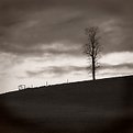
You do have a very good eye as well as a passion for this craft from what I have seen and read. At this point you really need to look carefully at getting your equipment lined up so that you are no longer limited by your equipment, or lack of it, as with the case here. Just a few little things like this can make a huge difference in the overall level of quality of your work. With better quality, you can then do many more things WITH that work. Hope this helps. Keep up the enthusiasm and passion. Keep following your dreams! Aloha.
|
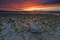
| Photo By: Chris Hunter
(K:25634)
|
|
|
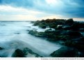
Critique By:
Vincent K. Tylor (K:7863)
6/11/2006 10:07:33 PM
The composition in this scene works for me Chris, but that's about all. This is clearly an instance where you needed to use some kind of graduated filter. A polarizer -as used here- simply reduces the glare throughout the entire image. In this image, you have two very different scenes in terms of lighting. You chose (or perhaps your camera automatically did), to meter on the lower portion; the rocks and ocean. In this case your exposure in that area is good. However, because the sun is close to setting, and because the sun has lit up the sky, and is therefore much brighter than the lower portion, it is subsequently over-exposed or "blown out" completely in my opinion. It looks colorless and somewhat bleached and definitely not very natural. This is exactly why anybody that tries to shoot sunsets prtofessionally uses Neutral Density filters, of which there are many kinds to choose from. The darker upper half of the ND filter would keep the sky position from blowing out while maintaining the light needed to illuminate the detail and the darker rocks in the lower portion. When looking at these two images:
http://www.usefilm.com/image/1085718.html
http://www.usefilm.com/image/1083765.html
I noticed the opposite problem here, though to a lesser degree; that the sky is exposed properly, therefore the natural, rich colors look good, while the lower portions are a bit too dark with very little detail showing.
The very rare case where I have learned I can get away with this issue is well illustrated by this image you took:
http://www.usefilm.com/image/1083765.html
In this case, it is so late in the evening that I have learned you can often get away with using nothing, simply because the lighting evens out before fading away altogether. Though usually this is possible it is not alway the case.
The best type of Neutral density filters system for sunsets and sunrises that I have found is with the Cokin system. Though Lee makes a system as well as Hoya. You simply screw on the mounts (with or without a polarizer) and you can add varying filters as you wish throughout the shoot. You can use up to three at one time even, though I don't recommend it. They also make sunset filters of different strengths that are also colored and graduated; meaning stronger filtration up top than on the bottom, for the reasons already mentioned.
cont...
|
| Photo By: Chris Hunter
(K:25634)
|
|
|
Critique By:
Vincent K. Tylor (K:7863)
6/2/2006 4:23:34 AM
This is what I would call excellent photography! The colorful Italian store at twilight, with the face visible through the windows, combined with the beautiful tulips (beautifully stacked) makes for a real treat for the one looking in. Very well seen and executed. The only suggestion the quickly came to my mind was to eliminate that extra free space on the right side. I would rather have flowers throughout the entire foreground scene. That "gap", in my opinion, shows too much of the less than attractive sidewalk and takes my eyes out of the scene, if even for just a moment. A simple crop makes this one near perfect! Good stuff here.
|
Photo By: Paul Lara
(K:88111)

|
|
|
Critique By:
Vincent K. Tylor (K:7863)
6/2/2006 4:05:33 AM
This is a beautiful rose, and of course, the droplets only add more "power to the flower"!
I would like to suggest trying either a longer lens, possibly an 80-200 zoom, or 105 macro for this kind of photograph. It may be posssible that you were just a bit too close for this kind of closeup for this type of mid-range lens, since none of the image looks to me, to be in clear, sharp focus. Another very vital tool for images like this from my eexperience are a tripod and if possible, a cable release. All closeups will really accentuate any kind of movement or camera shake, which also may have contributed to a less than optimal clarity here. Still, I think this is a very nice shot even as is. Some people actually like a little blur. But for me, and for most experienced shooters, a really sharp focus point would make something like this really, really special.
|
| Photo By: Marlyce Chastain
(K:4071)
|
|
|
Critique By:
Vincent K. Tylor (K:7863)
5/24/2006 10:14:05 PM
Looks like a painting! Very nice. Try adding a little more contrast and see what that does. Let me guess, you posted this the same day you took it as well.
I hate digital...
|
| Photo By: Scott Tylor
(K:407)
|
|
|
Critique By:
Vincent K. Tylor (K:7863)
5/23/2006 10:17:18 PM
From my experience, this photograph reminds me of the cccoold wind that blows right through you at this location in the morning. An interesting and unique perspective. Very well seen and captured Mattia! Aloha.
|
| Photo By: Mattia L.
(K:7625)
|
|
|
Critique By:
Vincent K. Tylor (K:7863)
5/23/2006 10:11:04 PM
Nice detail and excellent DOF here. I've learned one of the most important aspects of wildlife shooting is to try to get super-sharp eyes. And this you have done. A slight crop, or moving off center a bit may strengthen this just a little. Just my opinion. Nice catch, just as it is.
|
| Photo By: clive Morgan
(K:126)
|
|
|
Critique By:
Vincent K. Tylor (K:7863)
5/23/2006 9:43:36 PM
A very intereting looking animal. Well composed here with your slightly off-center framing. I also like how you included a bit of his environment, rather than extreme closeup. A little better sharpness would really make this one stand out even more. Nice capture.
|
| Photo By: Len Webster
(K:25714)
|
|
|
Critique By:
Vincent K. Tylor (K:7863)
5/16/2006 2:12:02 AM
Outstanding Exposure in this scene. I also like the variety of night-colors here. I might suggest cropping out the building on the right to simplify the composition just a little. It's just a bit busy in my opinion, then again, cities usually are just that. Nice work Jim. Aloha.
|
| Photo By: Jim Goldstein
(K:21230)
|
|
|
Critique By:
Vincent K. Tylor (K:7863)
5/4/2006 5:46:37 AM
Hello Alicia. I have read all 21 comments on this (though I do not read spanish very well). And while I do like the colors as well as the drops of water which are very well composed here; Not one single person has mentioned that this image is out of focus. Not one portion of this photograph is sharp and clear. The most important aspect to shooting close-ups like this, is detail and an unmistakable clarity. The 18-55 lens you use is not exactly ideal for this kind of shooting. Something like a 105, or 80-200, would give you and this image that extra-sharp detail so valuable with this type of shooting. I am more disappointed that nobody here has taken the time to offer this same advice. Therefore, why would the photographer (in this case you) change anything when shooting something like this the next time.
I hope not to offend you nor anybody at all; only offering honest, and hopefully helpful advice. You have a very good eye, just need to improve the technical portion a little bit. Take care.
|
| Photo By: Alicia Popp
(K:87532)
|
|
|
Critique By:
Vincent K. Tylor (K:7863)
5/3/2006 3:23:41 AM
Beautiful Image! I am not sure that even with Velvia 50, I could do any better than this regards color. I particularly like the detail you captured in those shadows. Is this Anahola Beach? Did you just take it today?
If so, you are a punk! I could not do that with film either...
|
| Photo By: Scott Tylor
(K:407)
|
|
|
Critique By:
Vincent K. Tylor (K:7863)
10/24/2005 11:18:18 PM
Some very nice tones here. Te sky especially has a dramatic appeal. I would suggest cropping out the lower portion of this image. In my opinion it looks too muddy and takes away from the rest of the scene. Otherwise very nice!
|
| Photo By: Bogdan Lutostanski
(K:59)
|
|
|
Critique By:
Vincent K. Tylor (K:7863)
8/6/2005 8:18:42 AM
I do find this version slightly improved James. Perhaps a few more points of contrast according to my monitor.
Post processing in my mind seems just as important as shooting, as well as when going to the light box to edit and choose. Each step can be tedious, but when all are done carefully, I find it gives us the best chance for creating consistent winners. There is just no real way around it, I guess, hard work is still the most important factor regardless of ones equipment.
I am happy to see you following your dreams from reading your bio. A tip of the hat to you for doing just that!! Keep up the good work. Aloha.
|
| Photo By: James Hager
(K:6285)
|
|
|
Critique By:
Vincent K. Tylor (K:7863)
8/5/2005 1:45:15 AM
I like the atmosphere with this image. The pieces of floating ice makes this work for me. I would only suggest adding perhaps a little more saturation, brightness and contrast to give it just a little more pop. Seems a little flat as posted. Just my opinion. Very nice work!
|
| Photo By: James Hager
(K:6285)
|
|
|
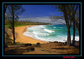
Critique By:
Vincent K. Tylor (K:7863)
8/2/2005 7:03:30 PM
VERY nice photograph Scott! Great colors and nicely composed with a little of everything here. Donkey's Beach is a secluded location with far less tourists than most anywhere. But in the middle of summer, to see it this empty is a rather pleasant surprise I am sure.
I like the image as is, but also feel that a slight crop would clean it up to a degree and strengthen the image altogether. I do not agree with cropping the right trees entirely, but can see how lessening those trees somewhat helps. Nice work from a beautiful location! Aloha.
|
| Photo By: Scott Tylor
(K:407)
|
|
|
Critique By:
Vincent K. Tylor (K:7863)
6/8/2005 7:30:14 AM
This one is beautifully composed Kim. Very tranquil scene indeed. The log has a few hotspots, but a better scanner would certainly help there. Great eye for this one! Aloha.
|
| Photo By: Kim Culbert
(K:37070)
|
|
|
Critique By:
Vincent K. Tylor (K:7863)
6/8/2005 7:22:25 AM
Nice soft blue tones here throughout. One reason the crop helps this Kim (in my opinion) is because the foreground is bit too bright for this scene, but even more importantly a bit too soft. I am surprised even at f/11 the depth is not better than this. It does have excellent potential in my mind, but I would like to see this at f/16-f/22 on a tripod. Usually with such a wide angle lens as you were using here, f/11 would be fine. Although now that I think about it, f/11 in this type of lighting would be a longer exposure than one second. Are you sure about f/11 Kim? Is it possible you started out at f/11 when there was more lighting, but as it became darker like this, the camera adjusted to something larger? That would certainly account for the lack of detail in the foreground. Now if this were a 10-20 second exposure, perhaps then you would be close to f/11 and have good depth throughout. Here is one darkened a bit through levels. I think by eliminating some of the brightness here, you take some of the emphasis off the weaker elements as well as add a bit more atmosphere. Or a little lesser crop than posted above would still work to improve this one in my mind as well.
By the way, your work Kim is looking outstanding. You have really grown as a photographer... (even though I might sound like I'm picking on you here...
|
| Photo By: Kim Culbert
(K:37070)
|
|
|
Critique By:
Vincent K. Tylor (K:7863)
3/13/2005 2:32:39 AM
Very nice tones here, and certainly an interesting subject. I'd just like to suggest a crop to focus a little more on the subject here. A Very nice capture!
|
| Photo By: Steve Silverman
(K:42)
|
|
|
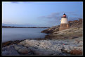
Critique By:
Vincent K. Tylor (K:7863)
3/13/2005 1:21:06 AM
A nice, peaceful and simple seascape/lighthouse capture. The f/16 aperture really maximized your depth, allowing for the bridge in the background to be as nice and sharp as the foreground. I'd suggest going back again when there are a few more clouds, or a little more dramatic weather or lighting to give us another perspective from this location. Very nice work!
|
| Photo By: Chris Hunter
(K:25634)
|
|
|
Critique By:
Vincent K. Tylor (K:7863)
12/14/2004 1:29:38 AM
Amazing work as always.
|
| Photo By: Lars Raun
(K:1701)
|
|
|
Critique By:
Vincent K. Tylor (K:7863)
5/7/2004 8:13:42 AM
Nice simple moody capture here. It's been a while since I looked at your work. Like you mentioned in your bio, you have gained much experience. Nice rich tones in most all of your portfolio.
My only suggestion here would be to crop out a portion of the foreground. While you would eliminate a bit of the better lighting below as well, I still think you strengthen this by bringing more attention to the tree and sky. Great atmosphere in this to say the least!
|
| Photo By: michaelle .
(K:3807)
|
|
|
Critique By:
Vincent K. Tylor (K:7863)
5/7/2004 7:53:03 AM
Very interesting capture here. I like the mood, the varying elements, the colors. Quite a unique image. I do think if the lone rock was less centered it would only strengthen this just a bit more. It could easily anchor either the bottom right or left very effectively. Just my opinion...still a nice scene just like it is.
|
| Photo By: Barry Wakelin
(K:7838)
|
|
|
Critique By:
Vincent K. Tylor (K:7863)
4/27/2004 9:07:47 PM
Feel free to e-mail me at vince@hawaiianphotos.net I'd be hapy to help anyway I can! Aloha.
|
| Photo By: LaMaro Hall
(K:3658)
|
|
|
Critique By:
Vincent K. Tylor (K:7863)
4/27/2004 8:43:33 PM
The composition is fine here. The title well describes what you were after. One thought that would improve this in my opinion, would have been to use a tripod and stop down to f/11 or even possibly f/16 to maximize your depth of field. While I like the amount of foreground road you've chosen here, it's just not sharp enough to work as effectively as it could. Stopping down would certainly solve this. The background sky also appears a bit too bright...is mildy distracting. I returned not too long ago with many similar types of images from the Pacific Northwest and one thing really saved the day so to speak over and over...bracketing! Practically each image was bracketed by .3 in each direction. I have found most all of the better images slightly under-exposed rather than over. It is much easier to add a measure of density to an image than it is to take it away. Just my two cents. This one is nice as is with even greater potential for another visit. Thanks too for your very well thought out comments on my images. Always appreciated! Aloha.
|
| Photo By: Becky V
(K:9699)
|
|
|
Critique By:
Vincent K. Tylor (K:7863)
4/26/2004 2:10:51 AM
This is really nice work. I like the composition of the trees, as well as the rough water. Palms, mountains, ocean and a colorful sky...looks pretty good to me. Here is one from the exact same location a couple of years earlier.
http://www.usefilm.com/image/166813.html
Thanks for the comments on my work as well. Perhaps we'll run into each other one day!! Aloha.
|
| Photo By: LaMaro Hall
(K:3658)
|
|
|
Critique By:
Vincent K. Tylor (K:7863)
4/21/2004 2:49:27 AM
Initially I decided not to send the toned down colored version but just the B&W. But before deleting it figured I'd post it anyway. Just one persons opinion here! Keep up the good work Kim. It's a pleasure to watch you progress!!
|
| Photo By: Kim Culbert
(K:37070)
|
|
|
Critique By:
Vincent K. Tylor (K:7863)
4/20/2004 9:28:50 PM
Hi Kim, nice to see you getting into some longer exposures. I too really like the composition here. You have brought us down into the water so to speak. I feel the layout of rocks framing the scene here is excellent. That is something that while it can be trained to a degree, is really more or less something you are born with. You either have an eye for a well laid out composition or you do not. This simply works...very nicely balanced.
That said, I will have to break away from the crowd here with regards the color and contrast. In my opinion there is just far too much going on. That filter by itself is one I have since retired just because it does not look very close to being natural. In addition here, the brightness or perhaps contrast appears to be pushed a few degrees too far. When you put the two together it gives me the impression that this is plugged into a wall socket. Portions of the sky as well as much of the moving water are simply too hot. But more than anything else the saturation is just too strong here in my honest opinion. I realize I am in the minority on this one, but wonder how much all of this great shot and praise really helps somebody especially if it encourages them to go out and do the same thing again. Your work IS very good and continues to improve. You also know that I like and use filters, just in this case here, it just seems over the top. Here is a B&W version to just illustrate how good the composition is. Try using a Cokin sunset 1 or 2. It is a graduated slight orange tint that keeps a much more natural appearance. Just my honest opinion here. Look forward to seeing more of these. Aloha.
|
| Photo By: Kim Culbert
(K:37070)
|
|
|
Critique By:
Vincent K. Tylor (K:7863)
4/1/2004 4:52:27 PM
Very dramatic scene captured perfectly! I like the extra contrast here. 7! Aloha.
|
| Photo By: Russell Love
(K:7006)
|
|
|
Critique By:
Vincent K. Tylor (K:7863)
4/1/2004 4:50:39 PM
Excellent work here Mr Russ! Great angle. I like how you capture the strength in his hands. Since when do you do B&W?? Can we see some pics of...you know...my friends ...the goats?? Aloha!
|
| Photo By: Russell Love
(K:7006)
|
|
|
Critique By:
Vincent K. Tylor (K:7863)
2/28/2004 8:08:40 PM
Can't fool me John. Yes you offer the most colorful comments that I have been privileged to enjoy. And yes behind the glasses and distinguished gentlemanly look is are a caring sincere soul...cat lover too. But inside the heart of it all is a big ole-firecracker...full of life, fire and zeal...sometimes wise-guy too!! Nice to meet the man behind the words!! Aloha.
|
| Photo By: John Charlton
(K:5595)
|
|