|
|
Critique By:
Vincent K. Tylor (K:7863)
6/20/2007 5:07:48 AM
Nice image Rob. I have shot here quite a few times as well. From my experience, these kind of shots work best when there is just a little bit of natural lighting left in the sky. Otherwise you do get a lots of dark spots and the whites tend to be a little over exposed. This is alright as it is, but it would have balanced better with some natural sky lighting as well. Just my two cents.
|
Photo By: Rob Graziano
(K:6678)

|
|
|
Critique By:
Vincent K. Tylor (K:7863)
12/8/2006 11:47:52 PM
Worth the hike!!!! Beautiful!
|
| Photo By: Scott Tylor
(K:407)
|
|
|
Critique By:
Vincent K. Tylor (K:7863)
10/11/2006 4:08:15 AM
This location reminds me of my old home in the Virginia mountains. Very colorful scene here. It makes me miss Fall. If you were to use a smaller aperture here, you would be able to get some of the foreground foliage a little sharper, which I think would be a slight improvement. Still a lovely scene just as you have it as well. Nice capture indeed.
|
| Photo By: Carolyn Wheeler
(K:1007)
|
|
|
Critique By:
Vincent K. Tylor (K:7863)
10/8/2006 8:57:07 AM
Beautiful colors, nicely exposed with an outstanding choice of composition. Even without the fishing pole, this would be a fantastic image. Having that lone, sharp fishing pole in this scene makes this image smashingly awesome. The little palm tree on the right is the icing on the cake for me! Great stuff here.
|
| Photo By: Scott Tylor
(K:407)
|
|
|
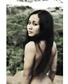
Critique By:
Vincent K. Tylor (K:7863)
8/31/2006 5:01:19 AM
Like the unusual angles here and high contrast. Her happy expression makes those features work here. You have some very unique stuff. Keep it up. Aloha.
|
| Photo By: levi fabiana
(K:328)
|
|
|
Critique By:
Vincent K. Tylor (K:7863)
8/31/2006 4:58:01 AM
Fantastic work Levi! The softness here in colors and her expression make this a real winner. Like the background too. Excellent depth of field and perfect sharpness in her face.
My only possible suggestion to improve this would be to crop out just a bit of the top-white portion above her head; is a little bit of a distraction for me, but that is a very minor suggestion. You have found your niche here. Great stuff in your portfolio! A hui hou.
|
| Photo By: levi fabiana
(K:328)
|
|
|
Critique By:
Vincent K. Tylor (K:7863)
8/24/2006 7:37:38 PM
ALL of your portraits are outstanding Levi. Creative, professional and all very interesting. You have a special gift!
Now, we need to get you that D200...
|
| Photo By: levi fabiana
(K:328)
|
|
|
Critique By:
Vincent K. Tylor (K:7863)
8/11/2006 8:56:29 PM
Looks like a painting. Nice mixture of flowers here. Kind of want to jump in...
Very nice photograph.
|
| Photo By: Ian Miller
(K:9190)
|
|
|
Critique By:
Vincent K. Tylor (K:7863)
8/10/2006 9:00:25 AM
This is really nice. Crystal clear sharpness. The added flowers are a nice bonus too. Impressive capture.
I want my macro lens back now...
|
| Photo By: Scott Tylor
(K:407)
|
|
|
Critique By:
Vincent K. Tylor (K:7863)
8/10/2006 8:51:51 AM
I want Sasha back...
We all miss her too much. Mischa is still looking for her friend and playmate. Zack is bored. Getting in the truck was never this easy...
Oh yes, Nice colors, good image. Or good colors, nice image.
heh...
|
| Photo By: Scott Tylor
(K:407)
|
|
|
Critique By:
Vincent K. Tylor (K:7863)
7/14/2006 2:05:06 AM
I think you've composed this quite well. Your angle here makes this big grouper look intimidating; like he is the king, surrounded by his court. Nice catch.
|
| Photo By: Carlen Boersema
(K:6789)
|
|
|
Critique By:
Vincent K. Tylor (K:7863)
6/29/2006 8:26:43 PM
Aloha Lamaro! What brings you to this place is the question? I was here two years ago, and was basically helping relocate my son Scott, (who'd just turned 18) to this beach town for his first summer away from home. I had come here myself for many special summers when I was his age that was just an outstanding experience to go through. You really grow-up being on your own like that. Guess I sort of put that idea in his head because there we were! Anyway, I was only there for about four or five days altogether with first priority helping him find a summer rental, a job and the lay of the land. So, when I did find a little time to "get out the gear", and you get a dreary day like this, it was somewhat of a downer. I did look for opportunities to find these "moody" kind of images, which of course took me to this location under the pier to begin with. The other four days were picture-perfect! I have some of of my own personal favorites from these few days here. This is the only series edited and scanned so far. Though it does not fully represent what this beach town is really like, at least from my perspective anyway, it does present the diversity to a degree of a place that has many different looks and some really FUN times. Candy Kitchen, Thrasher's Boardwalk Fries, Fishers Candy Popcorn, Bull on the Beach, Piezanos Pizza, Phillips Seafood... need I say more?
Peace to you island bro.
|
| Photo By: Vincent K. Tylor
(K:7863)
|
|
|
Critique By:
Vincent K. Tylor (K:7863)
6/29/2006 1:58:59 AM
Aloha Chris! A nice, peaceful location on the east coast here. I used to fish a lot in places like this in the mountains of Virginia. This brings back memories. I like the reflections as well as the leaves floating in the water. The B&W conversion makes sense too.
The portion of this image that I am less fond of however, is the sky; it really detracts from the rest of the scene in my opinion. From all of my experience in photography, this kind of sky is my absolute least favorite for landscape shooting. Where this type of thick, overcast, bright sky seems to work best (and is actually essential) is for shooting any kind of waterfalls, floral close up images or "into the forest" kind of shots due to the even lighting and lack of shadows. But then again, one of the keys for those types of shots is to absolutely minimize how much of that cloud cover is in the scene itself. The extra bright, thick cloud cover like this is just not very photogenic from my experience. It just seems to take my attention away from the darker, more intersting, richer portions. In this case, with this setting, I would have tried to strictly focus on the lake and trees, omitting the sky, if possible altogether. In fact you could almost make this into a panoramic, or a bookmarker and see how much potential the lower portion offers here without the sky. This is also another reason why I try shooting all locations from many different angles, focal lengths and vantage points. I hope you do the same. Thanks for your comments on my images too by the way. This IS how we all learn and improve! A hui hou.
|
| Photo By: Chris Hunter
(K:25634)
|
|
|
Critique By:
Vincent K. Tylor (K:7863)
6/27/2006 10:33:07 PM
I appreciate your comments on this. "eerie, relaxing, mysterious", "deep blue feeling", "mood makes the photo", "big blue", "luminous blues", "fog adds mysterious mood" "Lovecraft would be pleased", and others are basically what I felt when shooting this scene on this evening. I was actually disappointed with these dreary conditions this evening since I only had a limited time in Ocean City, with very limited opportunities for photography over all. Initially the fog was a downer too, but eventually I recognized the opportunity it offered as well.
Virtually no photoshop work and no cropping at all was done to this. No filters were used. Basically these were the conditions that existed. The long exposure does add an amount of drama and mood to this by allowing the ocean to somewhat mimic the rolling-in fog. I have others from different sunsets that are far more colorful and bright. Eventually will edit, scan and post some of these as well.
Ocean City Maryland is one of my favorite places to go! Great memories there. Thanks again for taking the time to share your thoughts. They are always appreciated. Aloha.
|
| Photo By: Vincent K. Tylor
(K:7863)
|
|
|
Critique By:
Vincent K. Tylor (K:7863)
6/27/2006 7:21:53 PM
A nice idea here with looking at the beach THROUGH the tall grass. That concept adds an extra element of mood in my opinion to a beach scene like this. Two suggestion that might help improve tthis image: For one the horizon is very slanted. I used to have this same problem years ago, but am conscience when shooting nowadays, and if I still get it wrong, will make sure to rotate the image in photoshop. The other suggestion would be to choose a smaller aperture (a larger number means smaller aperture) which would allow you to gain a greater measure of depth in this. I don't mind if the beach in the baackground is slightly out of focus, but in my opinion, stopping down some would make it a little more clear than we see here, which I believe would improve this. Or, by using a tripod you could actually stop down to f/16 or f/22 and have the entire scene as sharp as the grass. A nice idea as it is, but a few improvements, in my opinion, can make it even better!
|
| Photo By: Mary Therese Marie's Photos
(K:2174)
|
|
|
Critique By:
Vincent K. Tylor (K:7863)
6/23/2006 5:24:22 AM
I second Sergio's comment... WOW!
|
| Photo By: Scott Tylor
(K:407)
|
|
|
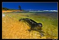
Critique By:
Vincent K. Tylor (K:7863)
6/16/2006 8:54:09 AM
Well, this for me is as good as it gets! These Hawaiian Monk seals are an endangered species. To have one get this close to you, in this clear water, with this setting surrounding you is simply outstanding!
Regarding the colors: If anybody were to visit Hawaii (near the equator) at this time of year when the sun is at its highest point all year, during the hottest, brightest part of the day, this IS exactly what the colors do look like if you are wearing polarized sunglasses. (which I highly recommend you wear by the way). The photo editor for Webshots, who Scott and I contract images with, used to say the same kind of thing about some of my submissions about colors being too saturated, that was UNTIL she actually flew out here and photographed locations like this for over a week in the summertime. The colors ARE this intense when the sun is this high. You get burned in less than an hour. Trust me, I know.
I showed up at this same location just after he took this and have five rolls from here, as well as the bays right behind where this was shot taken from, and the colors are simply stunningly brilliant. This is not just coincidental; but exactly why we make a point of shooting these kinds of images during this time of year. In January, everything would look very different... much different! There is nopthing unusual about the sky in this. In fact it's much less blue that what is typical. The reason why is that the sun is just beginning its descent which takes away some of that darker blue you often find out here in the tyopics. The colors of the sand, lit up with the mid-day sun, is exactly as you see it. Can be blinding to a degree. Take off your sunglasses, and you literally start squinting. The clear, shallow water has a slightly yellow tint in my opinion, but it is not overly-saturated by any means. A slight color balance from yellow to blue (and I do mean slight) would make the water look exactly what I have as well. Though to be honest, this is very close to what I remember as well.
Just looking at this with the seal relaxing, looking very cool and tropical (practically inviting us in the water) makes me want to go back to this spot and take a swim. Simply outstanding work Scott. One of my absolute favorites of yours! A hui hou.
|
| Photo By: Scott Tylor
(K:407)
|
|
|
Critique By:
Vincent K. Tylor (K:7863)
6/16/2006 1:24:51 AM
Fabulous! Love the DOF and background colors too. Excellent work!
|
| Photo By: taci yuksel
(K:469)
|
|
|
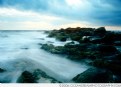
Critique By:
Vincent K. Tylor (K:7863)
6/14/2006 4:20:00 AM
I like the interesting textures in the sand with this. The swirling clouds also add a nice element. I think for this image to be better appreciated, it really needs to be posted a little larger than what we see here. I also would suggest using some type of darker border, due to the usefilm background being such a bright white. Because it is a smaller vertical image, the white background seems to take away from the actual beauty that you have captured. I would also suggest using two other things for seaside images like this at dusk. Some kind of a graduated filter to add a little more balance in the lighting, as the cloud appears as bright as possible, while the lower portion could use a little more detail. I would also suggest using a tripod for a little more sharpness as well as the opportunity to slow down the shutter and get some movement in the water. Still even as it is right now, you have something very nice in my sincere opinion. A few adjustments though just might make it even better.
|
| Photo By: Nicole Marcisz
(K:10268)
|
|
|
Critique By:
Vincent K. Tylor (K:7863)
6/14/2006 3:51:51 AM
I've looked at the entire series and would have to give this one the blue ribbon, with your first "Casey" image a close second. Excellent country setting! The tones also really make this stand out to me. Her facial expression as well as her hair gently framing her face give this a little extra feminine, cute mood, making this one a really special catch!
|
| Photo By: Paul Lara
(K:88111)
|
|
|
Critique By:
Vincent K. Tylor (K:7863)
6/11/2006 10:11:49 PM
You do have a very good eye as well as a passion for this craft from what I have seen and read. At this point you really need to look carefully at getting your equipment lined up so that you are no longer limited by your equipment, or lack of it, as with the case here. Just a few little things like this can make a huge difference in the overall level of quality of your work. With better quality, you can then do many more things WITH that work. Hope this helps. Keep up the enthusiasm and passion. Keep following your dreams! Aloha.
|
| Photo By: Chris Hunter
(K:25634)
|
|
|
Critique By:
Vincent K. Tylor (K:7863)
6/11/2006 10:07:33 PM
The composition in this scene works for me Chris, but that's about all. This is clearly an instance where you needed to use some kind of graduated filter. A polarizer -as used here- simply reduces the glare throughout the entire image. In this image, you have two very different scenes in terms of lighting. You chose (or perhaps your camera automatically did), to meter on the lower portion; the rocks and ocean. In this case your exposure in that area is good. However, because the sun is close to setting, and because the sun has lit up the sky, and is therefore much brighter than the lower portion, it is subsequently over-exposed or "blown out" completely in my opinion. It looks colorless and somewhat bleached and definitely not very natural. This is exactly why anybody that tries to shoot sunsets prtofessionally uses Neutral Density filters, of which there are many kinds to choose from. The darker upper half of the ND filter would keep the sky position from blowing out while maintaining the light needed to illuminate the detail and the darker rocks in the lower portion. When looking at these two images:
http://www.usefilm.com/image/1085718.html
http://www.usefilm.com/image/1083765.html
I noticed the opposite problem here, though to a lesser degree; that the sky is exposed properly, therefore the natural, rich colors look good, while the lower portions are a bit too dark with very little detail showing.
The very rare case where I have learned I can get away with this issue is well illustrated by this image you took:
http://www.usefilm.com/image/1083765.html
In this case, it is so late in the evening that I have learned you can often get away with using nothing, simply because the lighting evens out before fading away altogether. Though usually this is possible it is not alway the case.
The best type of Neutral density filters system for sunsets and sunrises that I have found is with the Cokin system. Though Lee makes a system as well as Hoya. You simply screw on the mounts (with or without a polarizer) and you can add varying filters as you wish throughout the shoot. You can use up to three at one time even, though I don't recommend it. They also make sunset filters of different strengths that are also colored and graduated; meaning stronger filtration up top than on the bottom, for the reasons already mentioned.
cont...
|
| Photo By: Chris Hunter
(K:25634)
|
|
|
Critique By:
Vincent K. Tylor (K:7863)
6/2/2006 4:23:34 AM
This is what I would call excellent photography! The colorful Italian store at twilight, with the face visible through the windows, combined with the beautiful tulips (beautifully stacked) makes for a real treat for the one looking in. Very well seen and executed. The only suggestion the quickly came to my mind was to eliminate that extra free space on the right side. I would rather have flowers throughout the entire foreground scene. That "gap", in my opinion, shows too much of the less than attractive sidewalk and takes my eyes out of the scene, if even for just a moment. A simple crop makes this one near perfect! Good stuff here.
|
| Photo By: Paul Lara
(K:88111)
|
|
|
Critique By:
Vincent K. Tylor (K:7863)
6/2/2006 4:05:33 AM
This is a beautiful rose, and of course, the droplets only add more "power to the flower"!
I would like to suggest trying either a longer lens, possibly an 80-200 zoom, or 105 macro for this kind of photograph. It may be posssible that you were just a bit too close for this kind of closeup for this type of mid-range lens, since none of the image looks to me, to be in clear, sharp focus. Another very vital tool for images like this from my eexperience are a tripod and if possible, a cable release. All closeups will really accentuate any kind of movement or camera shake, which also may have contributed to a less than optimal clarity here. Still, I think this is a very nice shot even as is. Some people actually like a little blur. But for me, and for most experienced shooters, a really sharp focus point would make something like this really, really special.
|
| Photo By: Marlyce Chastain
(K:4071)
|
|
|
Critique By:
Vincent K. Tylor (K:7863)
5/24/2006 10:14:05 PM
Looks like a painting! Very nice. Try adding a little more contrast and see what that does. Let me guess, you posted this the same day you took it as well.
I hate digital...
|
| Photo By: Scott Tylor
(K:407)
|
|
|
Critique By:
Vincent K. Tylor (K:7863)
5/23/2006 10:17:18 PM
From my experience, this photograph reminds me of the cccoold wind that blows right through you at this location in the morning. An interesting and unique perspective. Very well seen and captured Mattia! Aloha.
|
| Photo By: Mattia L.
(K:7625)
|
|
|
Critique By:
Vincent K. Tylor (K:7863)
5/23/2006 10:11:04 PM
Nice detail and excellent DOF here. I've learned one of the most important aspects of wildlife shooting is to try to get super-sharp eyes. And this you have done. A slight crop, or moving off center a bit may strengthen this just a little. Just my opinion. Nice catch, just as it is.
|
| Photo By: clive Morgan
(K:126)
|
|
|
Critique By:
Vincent K. Tylor (K:7863)
5/23/2006 9:43:36 PM
A very intereting looking animal. Well composed here with your slightly off-center framing. I also like how you included a bit of his environment, rather than extreme closeup. A little better sharpness would really make this one stand out even more. Nice capture.
|
| Photo By: Len Webster
(K:25714)
|
|
|
Critique By:
Vincent K. Tylor (K:7863)
5/16/2006 2:12:02 AM
Outstanding Exposure in this scene. I also like the variety of night-colors here. I might suggest cropping out the building on the right to simplify the composition just a little. It's just a bit busy in my opinion, then again, cities usually are just that. Nice work Jim. Aloha.
|
| Photo By: Jim Goldstein
(K:21230)
|
|
|
Critique By:
Vincent K. Tylor (K:7863)
5/4/2006 5:46:37 AM
Hello Alicia. I have read all 21 comments on this (though I do not read spanish very well). And while I do like the colors as well as the drops of water which are very well composed here; Not one single person has mentioned that this image is out of focus. Not one portion of this photograph is sharp and clear. The most important aspect to shooting close-ups like this, is detail and an unmistakable clarity. The 18-55 lens you use is not exactly ideal for this kind of shooting. Something like a 105, or 80-200, would give you and this image that extra-sharp detail so valuable with this type of shooting. I am more disappointed that nobody here has taken the time to offer this same advice. Therefore, why would the photographer (in this case you) change anything when shooting something like this the next time.
I hope not to offend you nor anybody at all; only offering honest, and hopefully helpful advice. You have a very good eye, just need to improve the technical portion a little bit. Take care.
|
| Photo By: Alicia Popp
(K:87532)
|
|