|
|
Critique By:
Doyle D. Chastain (K:101119)

12/7/2006 6:36:49 PM
A magical shot of warm and golden-red hues and glorious color very well presented. Congratulations on your award!
Regards,
Doyle I <~~~~~
|
| Photo By: Violetta Tarnowska
(K:24497)
|
|
|
Critique By:
Doyle D. Chastain (K:101119)
6/20/2007 3:21:44 PM
Nice crisp sihouettes Mary . . . and rich, well saturated color. Prefer this (myself) to the lavendar skies . . . though I know others would disagree. Something about it feels more realistic I guess . . . Excellent work!
Regards,
Doyle I <~~~~~
|
| Photo By: Mary Brown
(K:71879)
|
|
|
Critique By:
Doyle D. Chastain (K:101119)
8/25/2006 2:35:12 AM
Hmmmmmmm ". . . test upload" according to the about section. That calls for a "Test Critique"!

The lighting in this image has been done very well and I especially like the diffuse nature of it and the fact that it gradually descends into a darker, almost vignette style corner shadow. The shadowy area behind the object offers a pleasing mix of shadow and reflection . . . with the tonal range coming through with almost textbook variation - The cherrywood(?) is nicely saturated with an appropriate amount of color and the reflections in the hour glass give virtually no distracting views that would cause a viewer's eyes to be distracted from the overall composition. The brass accents and sand balance the range of light values and the minimal composition seems to be just about perfect with a pleasing touch of balance by the off-centered object and a higher and leftward shadow to off-set the alternate interest points along with the "rule" of thirds guidelines.
Since this IS a CC image I should point out that (IMHO) the white signature line in the lower left is really not good for this image . . . it's . . . you know, . . . a tad distracting. I would (were it mine) prefer to see it almost melt into the BG and likely make it a tad smaller as well.
Overall though . . . Nicely Done . . . !
"Test Critically" Yours,
Regards,
Doyle I <~~~~~
|
| Photo By: Phillip Cohen
(K:10561)
|
|
|
Critique By:
Doyle D. Chastain (K:101119)
7/6/2008 5:52:48 PM
I'm going to echo David on this one (ok, an English echo but you know what I mean). The darker clouds on the lighter left sky work well to accent this shot as does the tower. Love getting some info too. Nicely done and the tower central to the composition is one of those rare exceptions to the rule of thirds that works in this composition ver well!
Regards,
Doyle I <~~~~~
|
| Photo By: Julie Salles
(K:22654)
|
|
|
Critique By:
Doyle D. Chastain (K:101119)
3/22/2007 10:37:18 PM
Lana:
Just a couple of things come to mind on this shot. The black on black title leads me to point out that this has a blue hue throughout . . . not really black. True desaturation . . . or true B&W might add drama to the shot. Certainly work on the DOF mentioned as it will force the eye of the viewer to the subject. I have attached a very fleeting, quickly worked example for your consideration. In the example, I did an ersatz DOF adjustment which shows how the eye can be forced. This DOF adjustment CAN be done in camera by adjusting the aperture setting . . . using the shutter speed afterward to control exposure as needed. The light levels were also off a tad . . .
It's a good shot . . . and all I'm saying is that it COULD be better. While you'd like to get it all right in the camera . . . It is a rare photog that uses NO editing, since light levels and minor adjustments can dramatically increase the dynamics is virtually all shots. I sincerely doubt a prefessional or even good amateur exists who does not use something. Some things that can help are available free online.
This was a great idea and a challenging shoot which you did very well on. Keep in mind the rule of thirds and keep your focal point OUT of the center.
Nicely done.
Regards,
Doyle I <~~~~~
|
| Photo By: Lana M
(K:811)
|
|
|
Critique By:
Doyle D. Chastain (K:101119)
10/26/2006 2:58:49 PM
Hey Paulo!
I'm intrigued that Tony's critique made some of the points it did . . . everybody has their own opinion though! While I may not necessarily agree with him I always feel good when I see people making critiques . . . it gives us something to think about!
For myself . . . I liked the colors very much . . . and those red flags made for some GREAT accents. The juxtaposition of the red roof and the green tower tops (wonderful complementary colors) is awesome and even Tony admits their placement is spot-on!
As to the composition . . . I completely disagree with Tony. It's outstanding . . . and the award seems to back me up on that . . . I seldom see poor compositions carrying awards. I think the composition is perfect. The foreground, particulary, angles in a nice semi-circular arch that pulls the eye into the composition! Your right side ratio of sky (2), land (3) and water (1) is nicely broken along the rule of thirds with no centrality and that dynamic is furthered by the left-side of the composition which is sky (3), land (2) and water (1) -- Where 3 is most dominant and 1 is least dominant. All the lines, from shoreline to skyline work together in a great harmony pulling the eye into the shot.
Outstanding work Paulo . . . 7/7 (and congrats!)
Regards,
Doyle I <~~~~~
|
| Photo By: Paulo Santos
(K:445)
|
|
|
Critique By:
Doyle D. Chastain (K:101119)
9/12/2006 8:25:31 PM
Brenda this has beautiful color and tone and a wonderful minimalist composition - very sleek!
Your range of lighting from the left to the right side of the composition looks to be problematic but you seem to have handled it well as far as exposure . . .
One thing, in my opinion, that would help this shot along would be if the horizon line wasn't a centerline through the composition. Since the sky seems relatively free of drama . . . I would consider dropping the lower crop which comes very near to that wondrous tree reflection. If not possible due to outside influences . . . then I expand the sky upward. Just some thoughts of mine for your consideration . . .
This is a wonderful shot . . . I very much like it!
Regards,
Doyle I <~~~~~
|
| Photo By: Brenda Guiles
(K:6128)
|
|
|
Critique By:
Doyle D. Chastain (K:101119)
5/26/2006 9:28:23 PM
Jeroen:
I like the rich, well saturated colors in this - the horizon line and focus seem perfect. I do think that the beach walker would have enabled you to get much more imact if you had managed to capture him going the other direction, though. I am, also, intrigued by the way the wet sand seems to be circling around a slightly higher sandbar--almost like the viewer is about to get wet. Not knowing what was to the left, I can only speculate but (what if) you could have done a slight left-ward pivot. The contrail from the aircraft would be eliminated and the beach opened in front of the beach walker, not behind him. Very good shot all in all though.
Regards,
Doyle I <~~~~~
|
| Photo By: Jeroen Wenting
(K:25317)
|
|
|
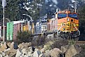
Critique By:
Doyle D. Chastain (K:101119)
3/24/2006 2:31:44 AM
Ty:
This is a nice capture with a great DOF, wonderful colors and a great subject that I would venture to say many people will enjoy. I especially like the three main areas, the rocks (with their colors and textures), the train, and the tree-lined backdrop. Each brings a fresh dimension to the overall composition.
The only critical suggestions I have would be that the blurry area above the first orange engine is a tad distracting. If it's steam or heat vapors, that's not quite clear and could probably be made more clear if the crop wasn't so low into it. The leading edge of the blurred area one can see a grey metal object with an oval, reminescent of a rear view mirror though it's probably an exhaust pipe, it's not clear what it is. I would seriously consider raising the ceiling (so to speak) and cloning out the circular area above the pipe.
You have a great capture here. Congratulations!
Regards,
Doyle I <------
|
| Photo By: Ty Olson
(K:37)
|
|