|
|
Critique By:
Marc Adamus (K:805)
1/15/2007 11:03:06 PM
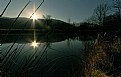
The sun-star effect is very nice but I find the composition to be lacking in several areas. The lower right corner is rather cluttered and busy and I find the reeds directly in front of the lens to be distracting. Something much more simple depicting just the trees, reflections and sun could have been more appealing here IMO.
|
| Photo By: Weston Dru
(K:3243)
|
|
|
Critique By:
Marc Adamus (K:805)
1/15/2007 11:00:50 PM
Awesome lines and textures. This would work very well as a B&W also.
|
| Photo By: p e t a .
(K:18700)
|
|
|
Critique By:
Marc Adamus (K:805)
1/15/2007 10:59:15 PM
Wow! That's just about as dramatic as it gets. I love the heavy blacks. Very unique and very well visualized shot. Great depth. Powerful image.
|
| Photo By: Federico Wilhelm
(K:734)
|
|
|
Critique By:
Marc Adamus (K:805)
1/15/2007 10:57:09 PM
Absolutely fantastic image in almost every aspect. Fascinating lines, patterns, textures and just the perfect atmosphere to compliment this dynamic subject. Outstanding work.
|
Photo By: david henderson
(K:16659)

|
|
|
Critique By:
Marc Adamus (K:805)
1/15/2007 10:55:44 PM
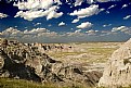
Nicole, I feel that the bottom 2/3 of the photograph adds nothing to the composition may even detract from the mountain peak. Little or no depth is added to the image with its inclusion due to a lack of features and leading lines in particular. In situations where the foreground engages the viewer and draws them in while complimenting the main subject, I strongly advocate the use of this much foreground. Just not here.
|
| Photo By: Nicole Besch
(K:72664)
|
|
|
Critique By:
Marc Adamus (K:805)
12/18/2006 5:19:40 AM
Aaron, I can assure you that the horizon is completely level.
|
| Photo By: Marc Adamus
(K:805)
|
|
|
Critique By:
Marc Adamus (K:805)
12/16/2006 5:24:44 PM
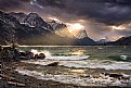
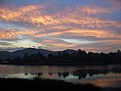
I would say that much of the interest in this landscape dominates the left side. The comp. feels a little unbalanced to me, but the converging waters at the bottom do help. I don't particularly like the branches blocking views of the mountain - I suspect you were trying to avoid the more typical perspectives from this area? I also feel the blues are quite oversaturated at the top of the frame. That said, this landscape is still enjoyable, and I'm sure you've captured it in other ways as well.
|
| Photo By: Douglas Ritchie
(K:211)
|
|
|
Critique By:
Marc Adamus (K:805)
12/16/2006 3:49:28 PM
The end of October, Larry.
|
| Photo By: Marc Adamus
(K:805)
|
|
|
Critique By:
Marc Adamus (K:805)
12/13/2006 12:25:55 AM
A work of art! Very interpretive. Fascinating image.
|
| Photo By: Yutaka Itinose
(K:22586)
|
|
|
Critique By:
Marc Adamus (K:805)
12/13/2006 12:20:44 AM
I'm sure you will enjoy shooting architecture with the 10-22. Wide angles open up so many possibilities there. I like your perspective here. I like the choice of Black and White medium, and the lighting really accentuates the features of the old room. The various writings on the walls give it a sense of history and life. I might also enjoy a similar image with a lone person or other subject to give it even more context, but it works very well as it is also.
|
| Photo By: Yazeed Al Ghuraibi
(K:4588)
|
|
|
Critique By:
Marc Adamus (K:805)
12/12/2006 8:35:19 PM
Yep. Much better, no doubt about it.
|
| Photo By: Aaron Doss
(K:121)
|
|
|
Critique By:
Marc Adamus (K:805)
12/12/2006 6:09:54 PM
Why use a gold-n-blue filter shooting digital? No reason to do this, as it's much more easily and accurately done in RAW processing. Of course you still need filters, but you can chuck the color filters, warmers and enhancers. The result you achieved here is two clicks away by increasing color temperature and adjusting tint to taste. I would suspect you used a GND filter also, or double processed the RAW file. Either way it worked well to control the dynamic range. The tonal balance is perfectly natural and highlight control is excellent. The light on the stone kearns is a huge asset. I do think the blue in the pool of water is too pronoucned due to the filter use. It's not exactly reflecting the hues in the sky so it jumps out at me. I do like the composition very much, just a few things to think about.
|
| Photo By: Henry Liu
(K:33)
|
|
|
Critique By:
Marc Adamus (K:805)
12/12/2006 5:43:32 PM
The gradient line is a bit too pronoucned. I'd try lightening the sky a little bit. Otherwise a well composed and dynamic landscape image.
|
| Photo By: Aaron Doss
(K:121)
|
|
|
Critique By:
Marc Adamus (K:805)
12/12/2006 5:35:54 PM
Pretty good catch here. I like the inclusion of the surroundings for scale and deep silhouettes. I might try to tone down the spotty highlights in the trees just a little, but a minor point. Overall good exposure control and conversion.
|
| Photo By: Tony Hunter
(K:4647)
|
|
|
Critique By:
Marc Adamus (K:805)
12/11/2006 3:14:23 PM
The only use of PS was recovering shadow detail in the mountain area. This is pretty much exactly what I saw.
|
| Photo By: Marc Adamus
(K:805)
|
|
|
Critique By:
Marc Adamus (K:805)
12/10/2006 8:31:45 PM
Outstanding image. The underexposure and B&W medium bring life and emotion to the scene and work well to handle the high contrasts. The wide angle and radial cloud formation around the subjects could not be better. The solitary figure adds necessary scale to a fascinating and unique image of landscape architecture.
|
| Photo By: Simone Pallesi
(K:3586)
|
|
|
Critique By:
Marc Adamus (K:805)
12/10/2006 7:46:04 PM
Amazing there wasn't even more flaring from within the double windows of a plane. I would definitely crop this in half and eliminate the distracting open blue sky at top to emphasize the dramatic clouds. The little bit of flare is easily removed in PS if you are so inclined.
|
| Photo By: Lajos Joo
(K:203)
|
|
|
Critique By:
Marc Adamus (K:805)
12/10/2006 5:57:38 PM
Dramatic and creative use of light and nice work handling the exposure. This isn't an accident, it's an image made by someone who knows what they're doing behind a camera. The simplicity of the composition is a real asset here. The interaction between sun and trees is just perfect. The warm color palette was a good choice. Excellent photography.
|
| Photo By: Roberta A.
(K:976)
|
|
|
Critique By:
Marc Adamus (K:805)
8/22/2006 5:01:53 PM
Powerful. Outstanding processing work. I love the use of darkness thoughout the image. The few highlights compliment the subjects perfectly. Just the faintest blue tone to the B&W works really well. Great work here!
|
| Photo By: Joel Calheiros
(K:229)
|
|
|
Critique By:
Marc Adamus (K:805)
8/22/2006 5:00:09 PM
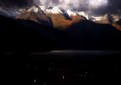
I WISH I WAS THERE RIGHT NOW! I really enjoy the lighting and sense of scale in this dramatic mountain scene.
|
| Photo By: Thomas Boehm
(K:49)
|
|
|
Critique By:
Marc Adamus (K:805)
8/22/2006 4:58:52 PM
Seems to be overpolarized/darkened or perhaps a grad filter that was a touch too strong. I like the scene but it could use a little tonal correction. Tone down the foreground, particularly the right side and bring out the contrasts while softening the harsh contrasts and dark blues/blacks in the sky, particularly at upper-left. Minor stuff really. Overall, I like it.
|
| Photo By: jacques brisebois
(K:73883)
|
|
|
Critique By:
Marc Adamus (K:805)
8/22/2006 4:55:31 PM
Did you scan an oil painting or was this taken from a fast moving vehicle? Is the softness intentional? I figure it must be. IMO it dosen't compliment this landscape though. I'd like to see the details - textures on the water, sky and trees. If you like it that's all that matters though.
|
| Photo By: Iryna Aleksashyna
(K:257)
|
|
|
Critique By:
Marc Adamus (K:805)
8/21/2006 3:26:46 PM
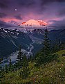
I've never understood what numeric ratings have to do with photography, or art in general, but I appreciate the compliment. The place is simple to find once arriving at the Sunrise lodge, in Rainier National Park. Simply follow the 'silver forest trail' to it's end and continue down the ridgeline about 1/2 mile.
|
| Photo By: Marc Adamus
(K:805)
|
|
|
Critique By:
Marc Adamus (K:805)
5/2/2006 10:16:24 PM
Micheal, this is in the Escalante. There are dozens of similar canyons too numerous to mention, some technical and others just a scramble. Since moving digital this past year I really do little or no bracketing. The instant feedback on Canon's huge, bright LCD screen is good enough for me, especially in a dim slot canyon. In rare situations I may take one or two bracketed exposures as I did often with film.
|
| Photo By: Marc Adamus
(K:805)
|
|
|
Critique By:
Marc Adamus (K:805)
4/14/2006 5:03:44 PM
Yes, eerie was certainly what I had in mind for this photograph. I'm not sure if any of my color work captures this mood quite as well.
|
| Photo By: Marc Adamus
(K:805)
|
|
|
Critique By:
Marc Adamus (K:805)
4/14/2006 1:59:45 PM
I enjoy this image Charles. One major suggestion though, is that the subjects would have more impact IMO facing away - as if they are gazing towards a beautiful view from the overlook. Still very nice as-is. Good work over there.
|
| Photo By: Charles Clee
(K:90)
|
|
|
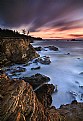
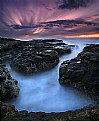
Critique By:
Marc Adamus (K:805)
2/26/2006 3:04:44 AM
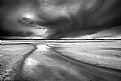
But there was nothing more to focus on, on the right side. Just open water. Any more right and you loose the impact of the rock striations.
|
| Photo By: Marc Adamus
(K:805)
|
|
|
Critique By:
Marc Adamus (K:805)
2/23/2006 8:58:25 PM
Micheal, one of the better landscape photographers in the world today, Pat DiFruscia is from Quebec. Looks similar to Kansas only frozen.
|
| Photo By: Marc Adamus
(K:805)
|
|
|
Critique By:
Marc Adamus (K:805)
2/19/2006 4:00:49 AM
Rob, I'm just lazy and haven't adjusted the time. No need to really. Roland, thanks. Hopefully this will be used in an upcoming OP issue. Harry, in addition to Tamron being a sponsor, they make excellent glass. No difference in sharpness between this and the 16-35 Canon and savings in price and weight. My next lens may be the 24mm TS-E.
|
| Photo By: Marc Adamus
(K:805)
|
|
|
Critique By:
Marc Adamus (K:805)
2/19/2006 2:44:50 AM
Bob, a very strong image here. The lighting really make it! Eye contact with the subject emerging from within the underwater foliage makes for a direct composition with instant impact.
|
| Photo By: Bob Whorton
(K:2740)
|
|