|
|
Critique By:
Martin Mora (K:4666)
8/13/2001 5:03:33 PM
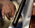
I am so impressed with the beautiful tones and stark shapness of this photograph, one can even see the string vibrating, a wonderful photograph you have here, Wonderful..
|
| Photo By: Bill Lange
(K:8)
|
|
|
Critique By:
Philippe Talbot (K:88)
8/5/2001 2:15:53 PM
Great image! very nicely done!
|
| Photo By: Bill Lange
(K:8)
|
|
|
Critique By:
Beverly Gustafson (K:1572)
8/2/2001 11:40:19 PM
Bill, Im slowly working my way through the images here at usefilm, and when I came upon this one I had to catch my breath! Unbelievably beautiful, stunning, awesome..This would make a wonderful print...on my wall :-)
|
| Photo By: Bill Lange
(K:8)
|
|
|
Critique By:
Debbie Groff (K:9569)
7/27/2001 8:19:30 AM
I still can't get over how those digital cameras get such true to life colors, and as Artie mentioned texture.
|
| Photo By: Bill Lange
(K:8)
|
|
|
Critique By:
Artie Colantuono (K:12275)
7/27/2001 3:16:59 AM
nice frame and texture here Bill....nicely done....
|
| Photo By: Bill Lange
(K:8)
|
|
|
Critique By:
Chris Whaley (K:3847)
7/26/2001 3:07:12 AM
Very cool.
|
| Photo By: Bill Lange
(K:8)
|
|
|
Critique By:
Artie Colantuono (K:12275)
7/24/2001 7:40:14 AM
gee Bill I think you left out one of the 16 billion colors in the spectrum...but only one....
Great frame and beautiful light....MAX punch....very very very WELL DONE.....
|
| Photo By: Bill Lange
(K:8)
|
|
|
Critique By:
Debbie Groff (K:9569)
7/23/2001 11:06:32 PM
This is just really nice and colorful. As you commented in the about: WOW!
|
| Photo By: Bill Lange
(K:8)
|
|
|
Critique By:
Artie Colantuono (K:12275)
7/22/2001 7:18:21 PM
Pj image Bill but wish you had a more open frame so as the picture could tell more of the story....the hands in this are distracting with out a little more visual information...
|
| Photo By: Bill Lange
(K:8)
|
|
|
Critique By:
Shailesh Master (K:38)
7/20/2001 1:59:14 PM
Hi Bill,
Very good lines,colour and composition.
Once again it is proven- the difference between the layman's eye and a lenseman's eye.
|
| Photo By: Bill Lange
(K:8)
|
|
|
Critique By:
John Charlton (K:5595)
7/14/2001 10:53:14 AM
Just came across this and I want to tell you how much I like it. Where's the re-do?
|
| Photo By: Bill Lange
(K:8)
|
|
|
Critique By:
Larry J. Rhodes (K:2441)
7/14/2001 9:06:33 AM
Simplicity is often the key to a great photograph, and this is simple, yet powerful. The angles of the shadow give this image a real sense of depth and perspective. The colors are JUST right...very natural looking. The lighting is high, yet the picture remains warm. I like the composition, angle, EVERYTHING, about this shot. Very well done, Bill. 
|
| Photo By: Bill Lange
(K:8)
|
|
|
Critique By:
Sylvia Jones (K:652)
7/13/2001 1:44:20 PM
Nice one William. Love the way the horses are spaced and the feeling of tranquillity you have captured.
|
| Photo By: Bill Lange
(K:8)
|
|
|
Critique By:
Bill Lange (K:8)
7/12/2001 9:08:14 PM
I want to thank eveyone for the encouraging comments and feedback.
This was one of those times when the photo almost took itself. The light in New Mexico at the Taos pueblo was fantastic, everything was very very intense. The ladder in a pueblo is almost a cliche image, but this scene seemed to capture everything about New Mexico - the sky, the clouds, the adobe walls, the high contrast of the shadow caused by the intense sunlight at the high altitudes.
This image impacted me emotionally and I was lucky enough to be in the right place at the right time.
I'm happy this image resonates with so many.
Another user's comment about a "stairway to heaven" seems very apropos.
thanks again,
Bill
|
| Photo By: Bill Lange
(K:8)
|
|
|
Critique By:
Chris Whaley (K:3847)
7/12/2001 8:37:24 PM
Wonderful shot...good eye.
|
| Photo By: Bill Lange
(K:8)
|
|
|
Critique By:
. . (K:2743)
7/12/2001 5:28:58 PM
the lines, the shadows, the colors...amazing...i just cant help but click on this image everytime it shows up randomly...
|
| Photo By: Bill Lange
(K:8)
|
|
|
Critique By:
al shaikh (K:15790)

7/12/2001 12:34:18 PM
This is very well done bill, The lighting really makes this shot pop in the frame nicely.
|
| Photo By: Bill Lange
(K:8)
|
|
|
Critique By:
Bill Lange (K:8)
7/10/2001 12:41:43 AM
FYI - this was outside, early morning with heavy fog - no spray cans.
|
| Photo By: Bill Lange
(K:8)
|
|
|
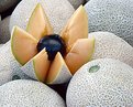
Critique By:
Artie Colantuono (K:12275)
7/8/2001 4:42:56 PM
the green stem is distracting but not terribly so....the lighting is flat and renders the plum darkish....fruit is not moist nor fresh looking...the cut open cantelope looks very very dry....Understand this was just a grab at a fruit stand....but an image still needs to sing.....very cool idea however and you did see it and it attracted you to it...
|
| Photo By: Bill Lange
(K:8)
|
|
|
Critique By:
Deleted User (K:2231)
7/8/2001 1:16:00 PM
love the composition.. would leave a little more space at top. also lighting is quite flat.. maybe would have used a flash as sidelighting to add some texture?
|
| Photo By: Bill Lange
(K:8)
|
|
|
Critique By:
Bill Lange (K:8)
7/8/2001 11:47:50 AM
I took this photo at a produce stand. This display was set up to sell the fruit. I didn't think the vendor would want me to start rearranging his display for my artistic reasons.
I could have remove the green with a cloning tool, but when trying to capture images of "natural" things, sometimes the distractions add to the charm.
This was hand held, which makes it even more rewarding.
thanks for the comments.
|
| Photo By: Bill Lange
(K:8)
|
|
|
Critique By:
Bill Lange (K:8)
7/8/2001 11:29:45 AM
I think the off-center dock is what makes this image, I did that delibertly. If centered, it becomes cliche'. The day was very overcast which accounts for the flatness.
BTW, I do agree with your symmetry comments on the "Locked Door" image.
Thanks again, you have a very critical eye. Your comments make me look again at my photos from a different perspective, which for me is what this site is all about.
|
| Photo By: Bill Lange
(K:8)
|
|
|
Critique By:
Artie Colantuono (K:12275)
7/8/2001 10:33:23 AM
nice job Bill nicely seen
|
| Photo By: Bill Lange
(K:8)
|
|
|
Critique By:
Artie Colantuono (K:12275)
7/8/2001 10:33:23 AM
the lighting in this is a little flat but it is not objectionable due to the content being so strong....However this is another one of those Symmetrical images that needs to be framed as such to add to the intensity of form of symmetry....adjust the frame so the deck is dead center and you'll see the symmetry works better...
|
| Photo By: Bill Lange
(K:8)
|
|
|
Critique By:
Artie Colantuono (K:12275)
7/8/2001 7:47:22 AM
Nice job Bill....nice frame and light....dof works well here...well done
|
| Photo By: Bill Lange
(K:8)
|
|
|
Critique By:
Artie Colantuono (K:12275)
7/8/2001 7:47:22 AM
congradulations on getting this up Bill....
really good light and textures here....this image is begging for a symmetrical frame as everything else is symmetrical about it...suggest mini crop on the right...to center and balance the symmetry...really nice image...
|
| Photo By: Bill Lange
(K:8)
|
|
|
Critique By:
Sylvia Jones (K:652)
7/8/2001 7:22:45 AM
Like the diagonal lines - always a difficult subject but I like the way you have framed the picture and the lead in line right down the middle. it is almost monochromatic.
|
| Photo By: Bill Lange
(K:8)
|
|
|
Critique By:
Deleted User (K:2231)
7/7/2001 11:20:18 PM
This looks like it should be an underwater coral. Very nice! It looks "glowing"!
|
| Photo By: Bill Lange
(K:8)
|
|
|
Critique By:
Chris Whaley (K:3847)
7/7/2001 10:29:25 PM
Very cool William. Looks alive.
|
| Photo By: Bill Lange
(K:8)
|
|
|
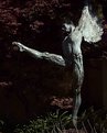
Critique By:
Christine Huie (K:63)
7/7/2001 10:23:47 PM
More often than not, I don't care for pictures of statues ... somehow it's stealing someone elses art/vision. This, however, is an exception. You picked just the right time of day which enhances the texture beautifully. The light statue against the dark background is very powerful. I miss the top of the left arm a little but with the light fall-off it's not the end of the world.
Good Job!
|
| Photo By: Bill Lange
(K:8)
|
|