|
|
Critique By:
Dawna G. (K:7709)
6/20/2002 6:09:36 PM
this is a very serene feeling image, makes me want to go for a walk there! the softness of the image works here.
|
| Photo By: Carl Beihl
(K:357)
|
|
|
Critique By:
Koen B (K:3279)
6/20/2002 1:49:46 PM
Beautiful shot ! To me it has the feeling of a fairy tale scene 
|
| Photo By: Carl Beihl
(K:357)
|
|
|
Critique By:
Kristupa Saragih (K:1031)
6/5/2002 4:24:24 PM
Nice shot... but IMHO you shouldn't use soft filter in this shot because it doesn't add any value
...the bright are on bottom left is too distracting and should be eliminated and these objects need a fill-in light from right
|
| Photo By: Carl Beihl
(K:357)
|
|
|
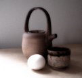
Critique By:
Carl Beihl (K:357)
6/5/2002 2:22:32 PM
Thanks Maggie for the lighting suggestion. It's a good point. Another way I could have solved it would have been to rotate the whole still life a little more clockwise. That way, the cup might have escaped the shadow of the teapot.
I added some grain with Photoshop, and some soft blur and some luminesence. I'm looking for a painterly result, much like that rendered by the Flemish painters.
|
| Photo By: Carl Beihl
(K:357)
|
|
|
Critique By:
Deleted User (K:6775)
6/5/2002 10:57:40 AM
Hi Carl...I love the feel of this image...not sure if you did something in ps or its the type of film you used to get this soft grainy effect. This image looks muck like a painting.
Only thing I would have done differently here is to use a white reflector on the right side to bounce some light into the shadowed area so you could see the edge of the little cup and separate it from the teapot....*smile*...Maggie
|
| Photo By: Carl Beihl
(K:357)
|
|
|
Critique By:
CJ McKendry (K:1388)
5/17/2002 4:05:18 AM
I can't believe I'm the first to comment on this photo! It's stunning! Awesome!
|
| Photo By: Carl Beihl
(K:357)
|
|
|
Critique By:
Carl Beihl (K:357)
5/14/2002 6:21:14 AM
Alisa and Bill, thanks for your ideas on how to make this a better photograph. I'll take a couple of minutes with Photoshop and see what develops. [Sorry.]
I do appreciate the feedback.
|
| Photo By: Carl Beihl
(K:357)
|
|
|
Critique By:
Carl Beihl (K:357)
5/12/2002 6:22:05 PM
Kim and Koen, thanks for your insightful comments. With both of these photographs I was trying to capture that "old" feeling... the light and luminesence exploited by the old Flemish painters. That's why I welcomed the blend into darkness. Maybe I should have included a dead rabbit or pheasant for the mood. I used only the available light from an adjacent north window.
I appreciate your thoughts, thank you.
|
| Photo By: Carl Beihl
(K:357)
|
|
|
Critique By:
Koen B (K:3279)
5/12/2002 2:25:01 PM
Kim, I do not mind the heavy shadows either - except then at the lower right point of the wooden object where it blends invisibly with the blanket. I was actually asking if it was intentionally to have them up to the point where there is little or no detail left visible (at least on my monitor).
|
| Photo By: Carl Beihl
(K:357)
|
|
|
Critique By:
Kim Culbert (K:37070)
5/12/2002 2:14:55 PM
Nice softness to this image... feels like old times. Especially the blanket used for a backdrop. I think you've done well with the lighting, as I don't mind the heavy shadows at all.. they give the image an old fashioned feel.
|
| Photo By: Carl Beihl
(K:357)
|
|
|
Critique By:
Koen B (K:3279)
5/12/2002 1:40:19 PM
Beautiful colours and that soft window light. I think it's nice !
|
| Photo By: Carl Beihl
(K:357)
|
|
|
Critique By:
Koen B (K:3279)
5/12/2002 1:20:44 PM
It seems you used a light source positioned at the rear left. The shadows are a bit strong, you could light them up using a reflector. I like the mood of the photo ! The colours fit together well (all brown-red-purple). The gray-green of the objects in front are very different in colour, but they seem to fit.
|
| Photo By: Carl Beihl
(K:357)
|
|
|
Critique By:
Terrence Kent (K:7023)
5/8/2002 5:32:50 PM
Great light...
|
| Photo By: Carl Beihl
(K:357)
|
|
|
Critique By:
Carl Beihl (K:357)
5/8/2002 3:08:45 PM
We're having another one of those days that produce the kind of light necessary for this kind of picture. Afternoon rain. North window light.
Thanks everyone for your generous feedback. Now, I tend to agree that another material or color might be a better resting place for the pears and vessel. I underestimated the reflective nature of raw silk fibers, even in very soft light.
What a great place to learn. Thanks.
|
| Photo By: Carl Beihl
(K:357)
|
|
|
Critique By:
Carl Beihl (K:357)
5/8/2002 3:00:54 PM
Ken, thanks for your thoughful comments. While the color spots do, I think, give the photo some provocation I've come to agree with you and the others that it's probably a better photograph in simple black and white.
|
| Photo By: Carl Beihl
(K:357)
|
|
|
Critique By:
KEN WINDSOR (K:30)
5/8/2002 1:44:58 PM
Let us remember walking into some of the great restaurants of the world, and remember the images seen on the walls.
Mostly black and white - they were images such as this one.
The lighting is superb - with the figures almost Lowry-like in their appearance. As an exercise in objective thinking it works - but as a pure black and white image it would, to me anyway, work better.
|
| Photo By: Carl Beihl
(K:357)
|
|
|
Critique By:
Mary Sue Hayward (K:17558)

5/8/2002 5:02:02 AM
To me, this is an intriguing image. I've tried similar shots before and failed. I love the different textures. The hot foreground...well, to my eye that is part of the tension in the photograph. Although there is a distinct dark/light division, you still managed to capture detail in both areas. And those green pears...you nailed them. To me it is a bit right-heavy as well, but again this adds to the tension. Very impressed.
|
| Photo By: Carl Beihl
(K:357)
|
|
|
Critique By:
Tony Blei (K:575)
5/7/2002 11:42:54 PM
What a great still life! I'm sorry, I'm not going to be like the others who feel the foreground is too hot. (Look! The Emporer has no clothes!!!) I see a natural gradient and you still have detail at the very edge of the photograph -- this picture is just plain nice!! I wish I would have taken it -- If I had, I would print it and hang it on my wall just as it is. Keep up the good work. -- Tony
|
| Photo By: Carl Beihl
(K:357)
|
|
|
Critique By:
Kim Culbert (K:37070)
5/7/2002 7:11:50 PM
I really like the composition of this shot as well. There is a bit of a painting-like feeling to it. I agree that the foreground is too hot, but I like the light on the rest. Maybe next time try using something to block the light from the carpet infront of the pears so its not as bright. I really like the rim-light that shows the back edge of the pot... gives it great depth! Nicely done!
|
| Photo By: Carl Beihl
(K:357)
|
|
|
Critique By:
Carl Beihl (K:357)
5/7/2002 6:51:58 PM
I think I lost most of the grainy texture when the image went down in size. Hmm. I was looking for a very painterly feel. The cloth is hand woven raw silk, I made the pot, and the pears, well...
I wanted the green of the pears to jump out across the white and pull you into the darkness of the pot. Now, looking at it considering your comments, I think you're probably right.
Thanks, Sam.
|
| Photo By: Carl Beihl
(K:357)
|
|
|
Critique By:
Samuel Downs (K:7290)
5/7/2002 4:35:51 PM
Carl, On my screen, I don't really get much film grain. I do like the image though. The color of the pears are smooth and have good tones. I like it all - except maybe for the very bright foreground (carpet?) that is distracting from the main subjects... All in all a great shot! Keep 'em coming... Sam
|
| Photo By: Carl Beihl
(K:357)
|
|
|
Critique By:
Carl Beihl (K:357)
4/26/2002 10:09:52 AM
Thanks, David. The panoramic view to the right of this shot includes the Castle Dunvegan. And, to the left, the Three Chimneys restaurant. Eat there. The food is superb.
|
| Photo By: Carl Beihl
(K:357)
|
|
|
Critique By:
Carl Beihl (K:357)
4/26/2002 10:07:15 AM
I was trying to develop the sense of bleak desperation that is so fundamental to Scottish history, especially Skye. I wanted to establish a feeling of longing by keeping the mist misty and the haze hazy. I don't think I really got what I wanted. There are a lot of pictures waiting to be taken at Armadale.
|
| Photo By: Carl Beihl
(K:357)
|
|
|
Critique By:
Carl Beihl (K:357)
4/26/2002 9:57:23 AM
Wow, what a great idea. I wish I seen it or thought of it in that frantic moment of catching that mood in a "model" who takes no direction. Thanks.
|
| Photo By: Carl Beihl
(K:357)
|
|
|
Critique By:
Carl Beihl (K:357)
4/26/2002 9:54:43 AM
Thanks for your comments. Those giant plane trees and their big leaves make great shadows on late mornings. When I looked up it was almost like seeing the changing surface of the river. I wanted to capture that and the interesting colors of the faded sign and plaster walls.
|
| Photo By: Carl Beihl
(K:357)
|
|
|
Critique By:
Carl Beihl (K:357)
4/26/2002 9:49:15 AM
Thanks for your comments. In the original image, on the right side, I had framed a band of black background at the corner of the building. I had put it there to give the grape someplace to go. For this iteration, I cropped it out.
|
| Photo By: Carl Beihl
(K:357)
|
|
|
Critique By:
Carl Beihl (K:357)
4/26/2002 9:37:28 AM
I saw this man and boat coming through the humid morning mist. I liked the mood set up by the green. My thought was to establish him in an intention to reach something, that he was going somewhere. So in taking the picture, I tried to bring in the prows of the docked boats.
I agree with Koen. It's either the one boat or all of the boats. Thanks for all of your comments and ideas.
|
| Photo By: Carl Beihl
(K:357)
|
|
|
Critique By:
chris meyer (K:597)
4/26/2002 6:17:10 AM
David is right. Crop out the entire reflection in the bottom-right.
|
| Photo By: Carl Beihl
(K:357)
|
|
|
Critique By:
Koen B (K:3279)
4/26/2002 5:38:36 AM
I think, it would be better to show OR more of the boats, OR just not to include the boats. If you'd include more of the boats you could possibly eliminate the other side of the river. There is, however, a large distance between the fisherman and the boats. Maybe it would have been interesting to wait until he came closer.
|
| Photo By: Carl Beihl
(K:357)
|
|
|
Critique By:
David N. VanMeter (K:552)
4/26/2002 5:29:00 AM
I apologize for my spelling, I meant distract, not sitract. I don't know what sitract means.
|
| Photo By: Carl Beihl
(K:357)
|
|